You hear me talk about these three words a lot.
Light.
Color.
Design.
They show up in my teaching, my writing, my workshops, my rants, my quiet observations, and—most importantly—my photographs. To some people, they probably sound like well-worn photography buzzwords. The kind you’d expect to hear tossed around in a beginner class or printed on a laminated cheat sheet.
But to me, they are none of that.
They are not concepts I reach for after the fact.
They are not boxes I check.
They are not things I consciously “apply” to a photograph.
They are how I see the world.
Long before I lift an iPhone. Long before I frame anything. Long before I even think about photography as an act, my brain is already sorting reality through those three filters. Light. Color. Design. Not as rules. Not as formulas. But as instincts.
This is not academic.
It’s visceral.
Most of the time, when I look at one of my photographs—especially the ones that stay with me—I can tell which of the three was in the driver’s seat.
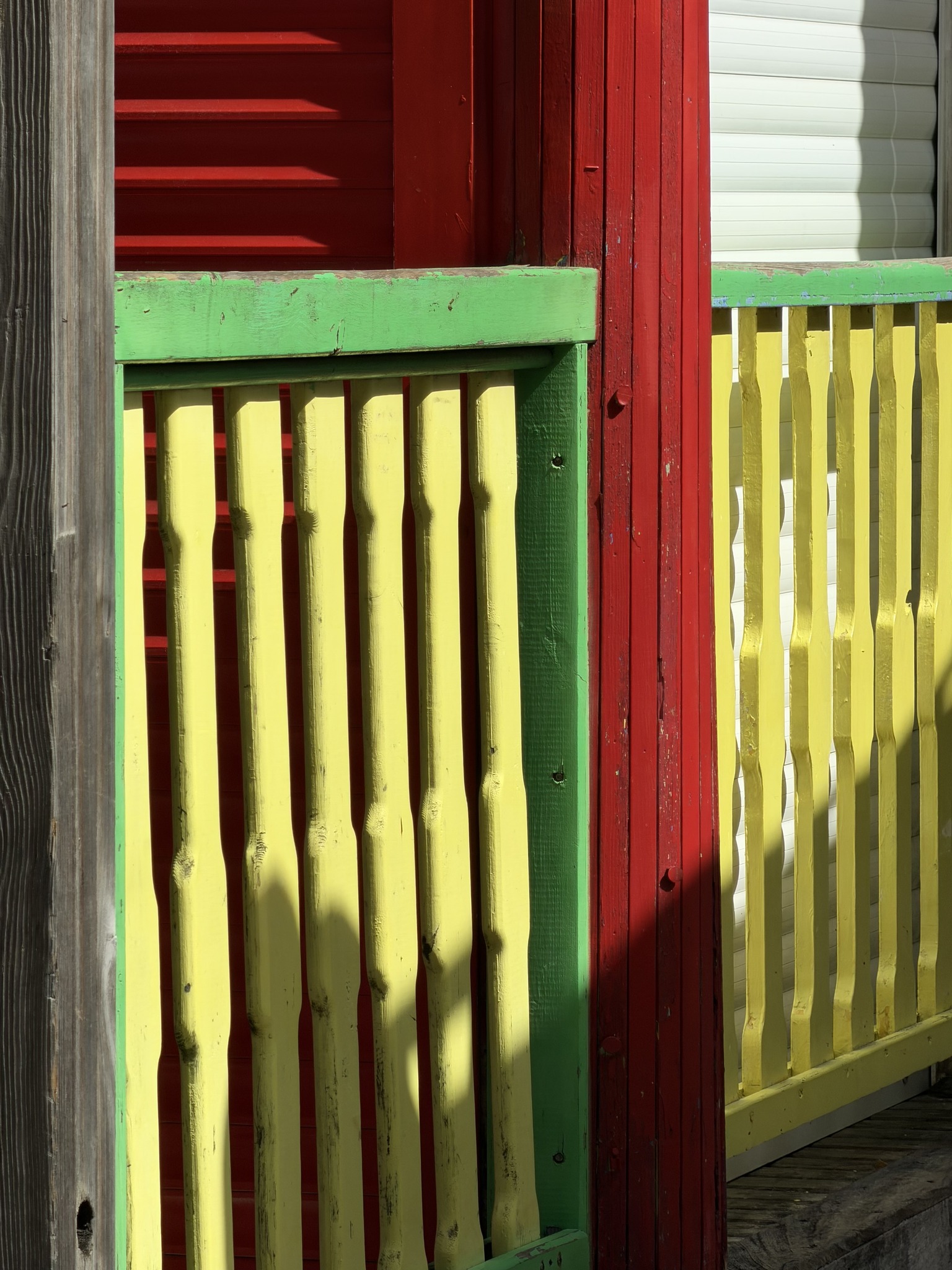
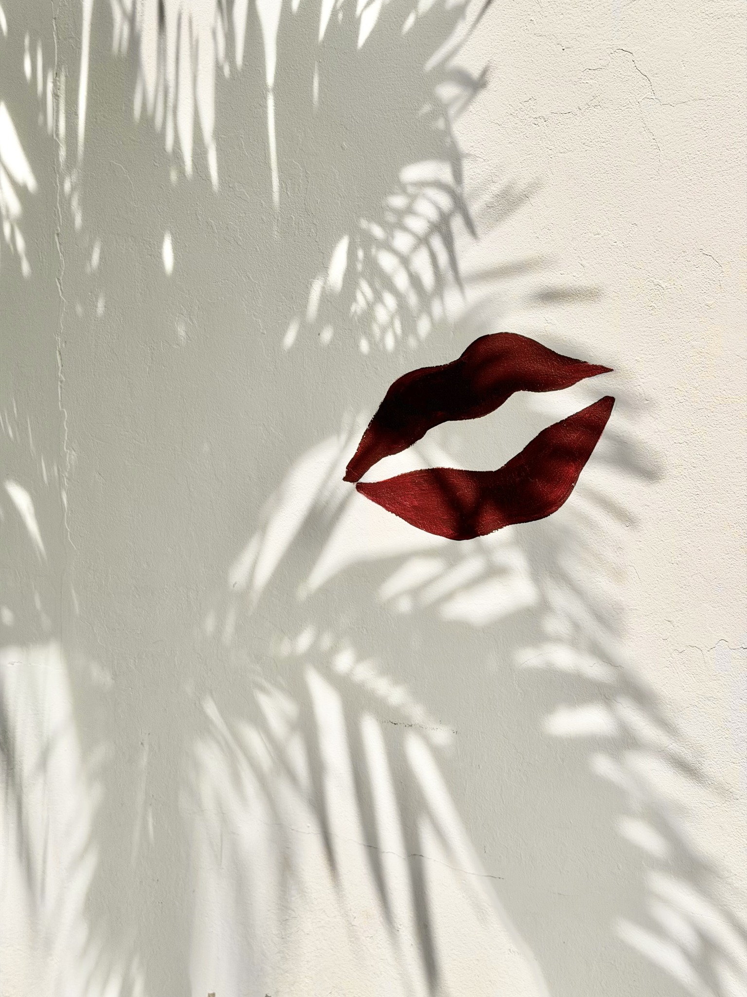
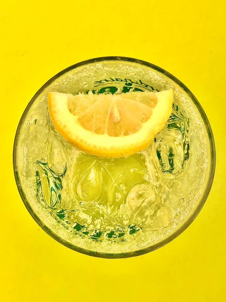
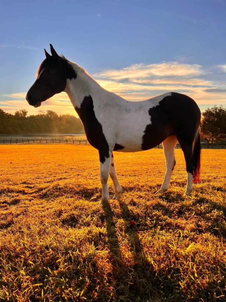
Sometimes it’s light doing all the heavy lifting. The way it falls, cuts, wraps, grazes, or disappears. Light that reveals just enough. Light that withholds. Light that doesn’t announce itself but quietly insists.
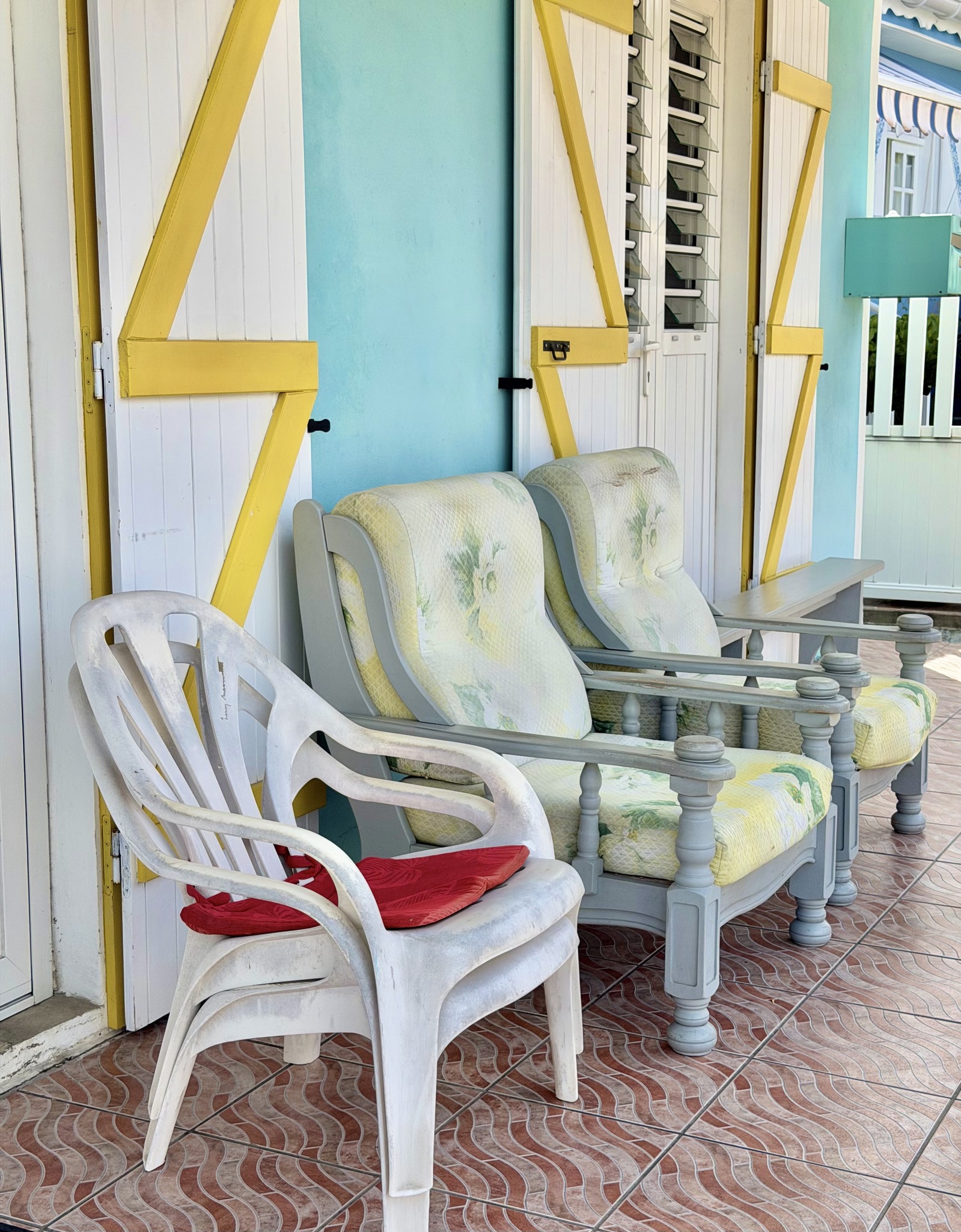
Other times it’s color. Loud or restrained. Harmonious or jarring. Color that seduces, provokes, or unsettles. Color that has nothing to do with subject matter and everything to do with emotional temperature.
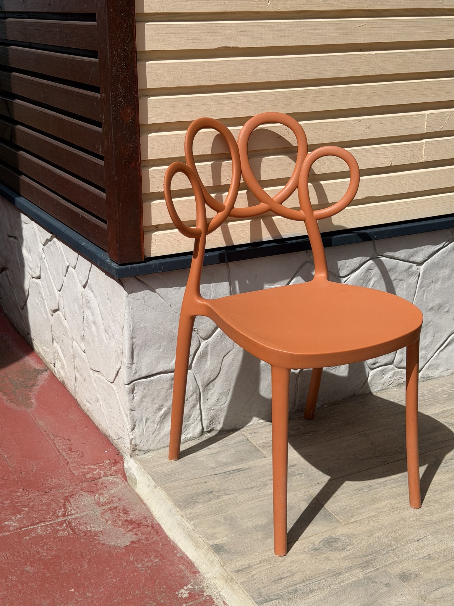
And often—maybe more often than people realize—it’s design. The least talked about, most misunderstood of the three. Design as structure. As geometry. As balance, tension, rhythm, and spacing. Design as the invisible scaffolding that holds a photograph together even when nothing “interesting” is happening.
In most of my images, one of these leads.
The other two follow.
They play support roles.
They whisper instead of shout.
They do just enough to keep the photograph from collapsing.
That, by the way, is perfectly fine. More than fine. It’s honest. It’s realistic. It’s how real photographs actually work.
But every once in a while—less often, and never on command—something rare happens.
All three show up in the same frame.
Light arrives with intention.
Color knows exactly why it’s there.
Design locks the whole thing into place.
Viola.
That’s the moment I pay attention.
Not because it’s flashy. Not because it’s technically impressive. But because it feels complete. Like a sentence that doesn’t need another word. Like a chord that resolves exactly where it should.
These are not the photographs that scream.
They don’t beg to be liked.
They don’t need explanation.
They just sit there—quietly remarkable.
That word matters to me. Remarkable. Not “great.” Not “epic.” Not “award-winning.” Remarkable in the literal sense: worth remarking on. Worth stopping for. Worth lingering with for more than a half-second scroll.
When I’m editing, sequencing, or curating a gallery, these are the images that slow me down. I don’t rush past them. I don’t second-guess them much. I don’t ask whether other people will “get it.”
I already know why I got it.
Light. Color. Design.
When they align, I feel it physically. A subtle internal click. A quiet yes. A sense that the photograph knew what it was doing before I did.
This gallery—the one I’m showing alongside these words—is exactly that. Not a collection of my “best” photos in any traditional sense. Not a highlight reel. Not a greatest-hits package designed to impress.
It’s a gathering of moments where the trinity showed up together.
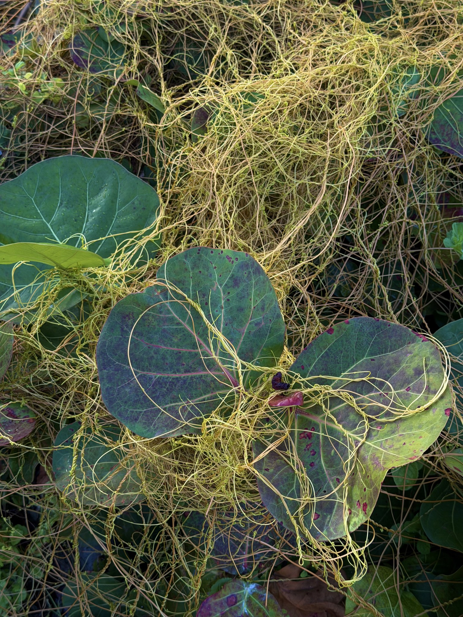
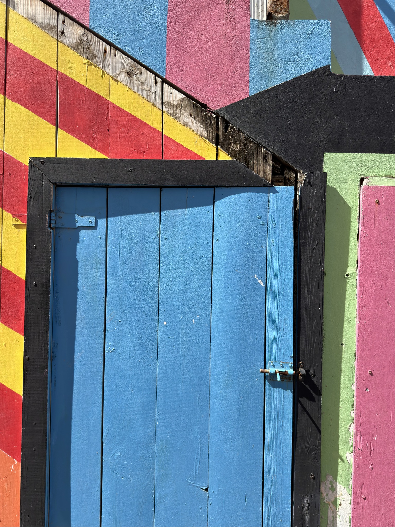
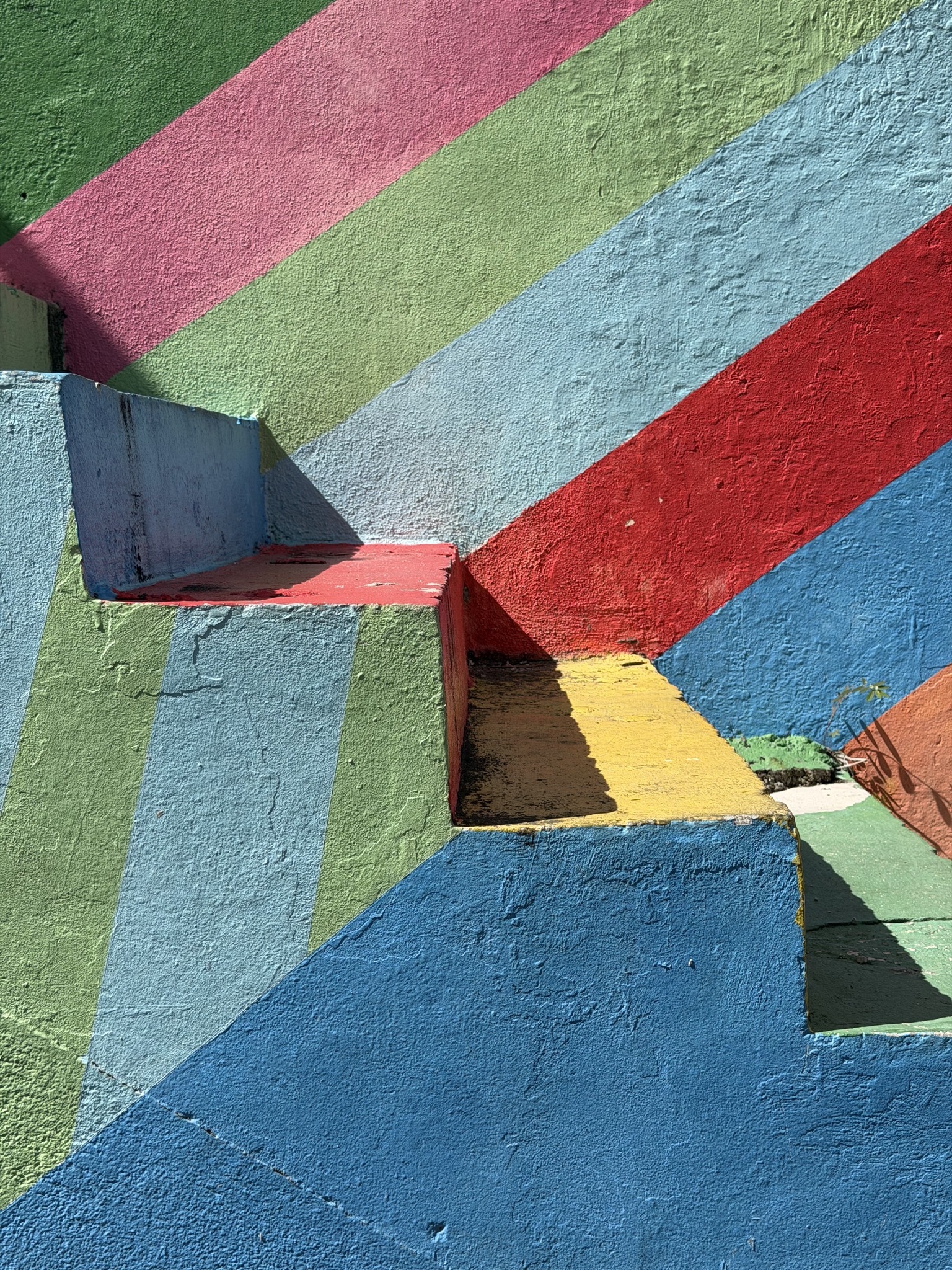
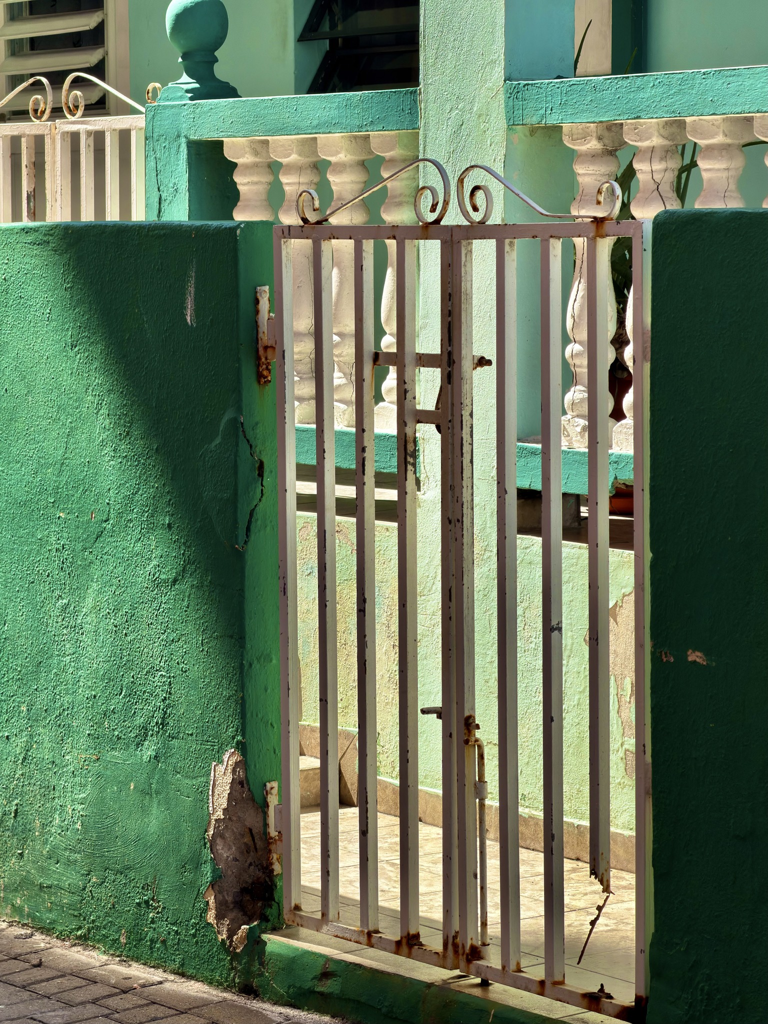
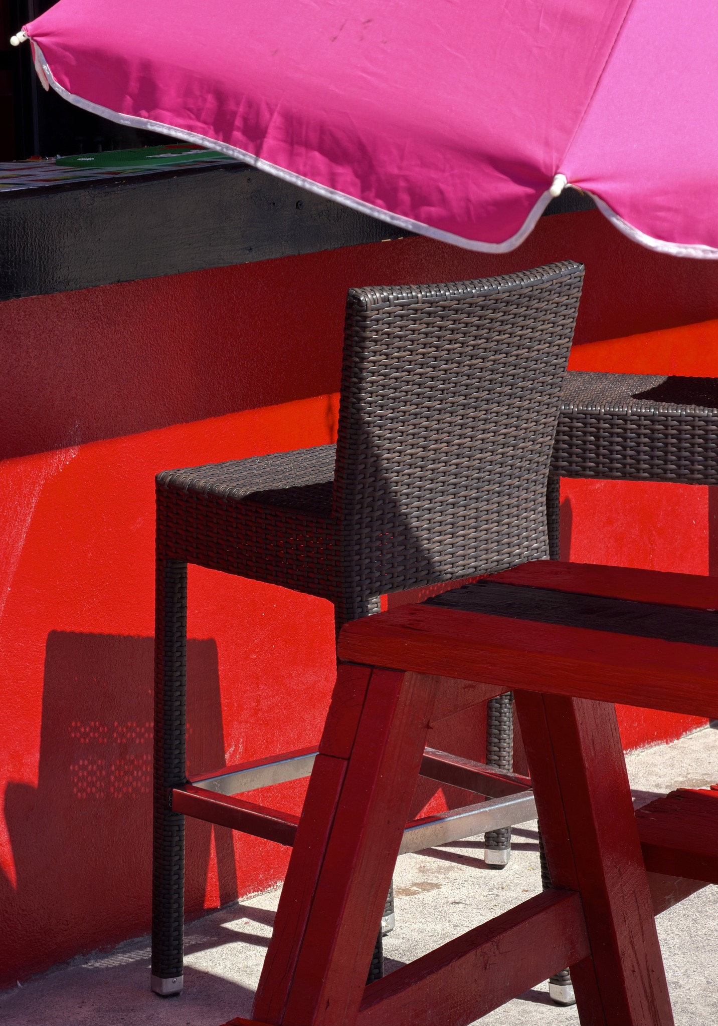
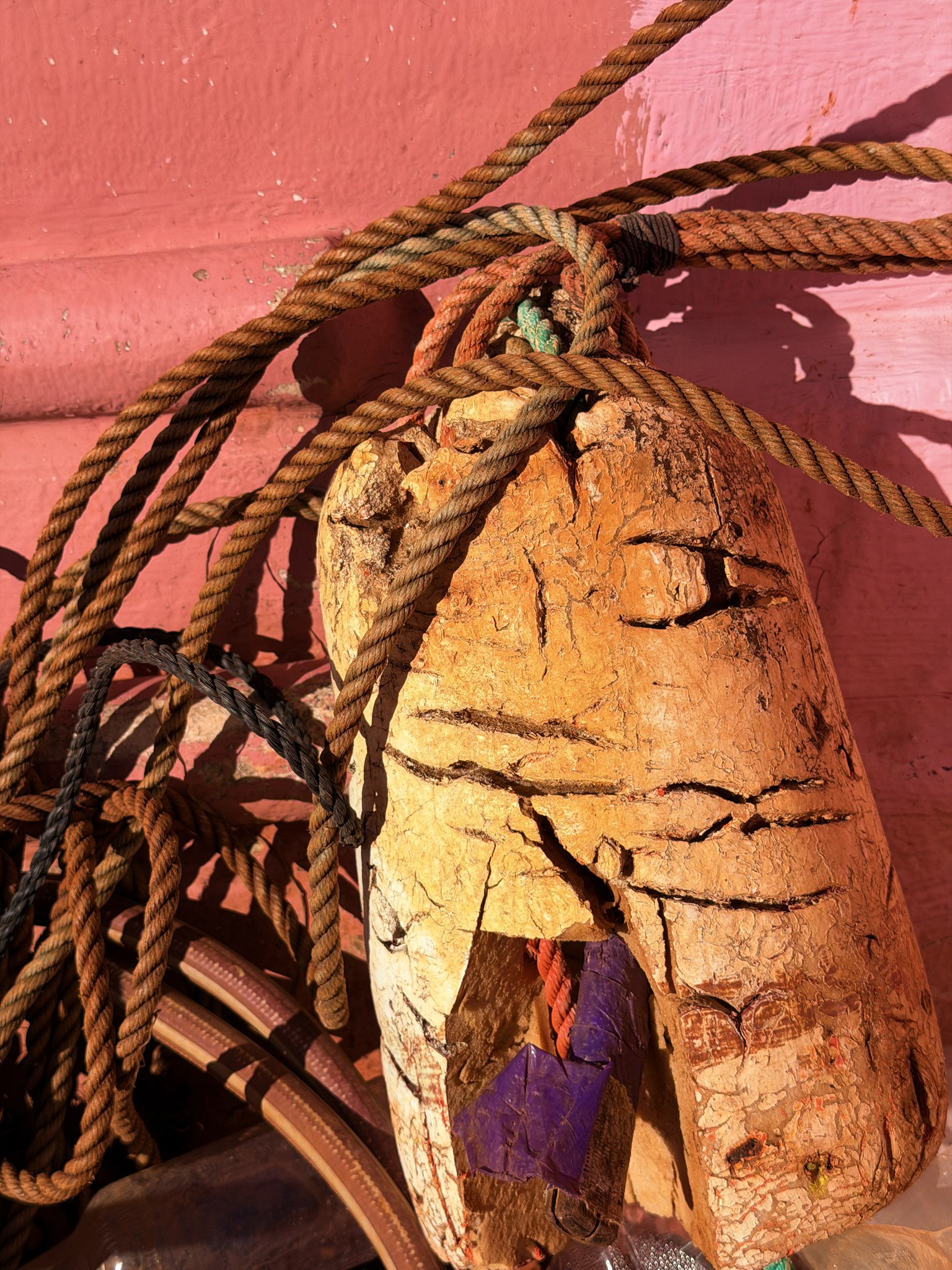
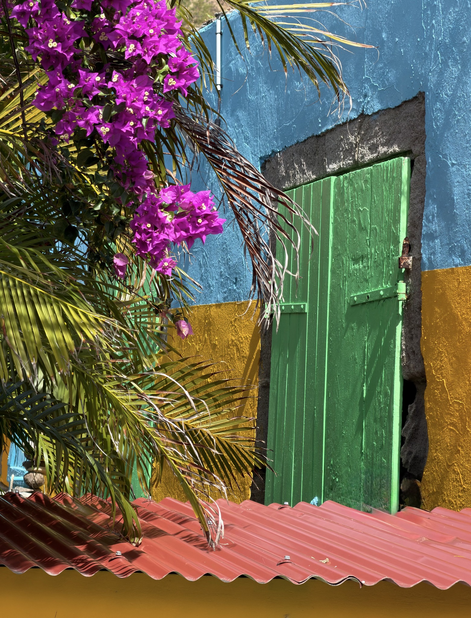
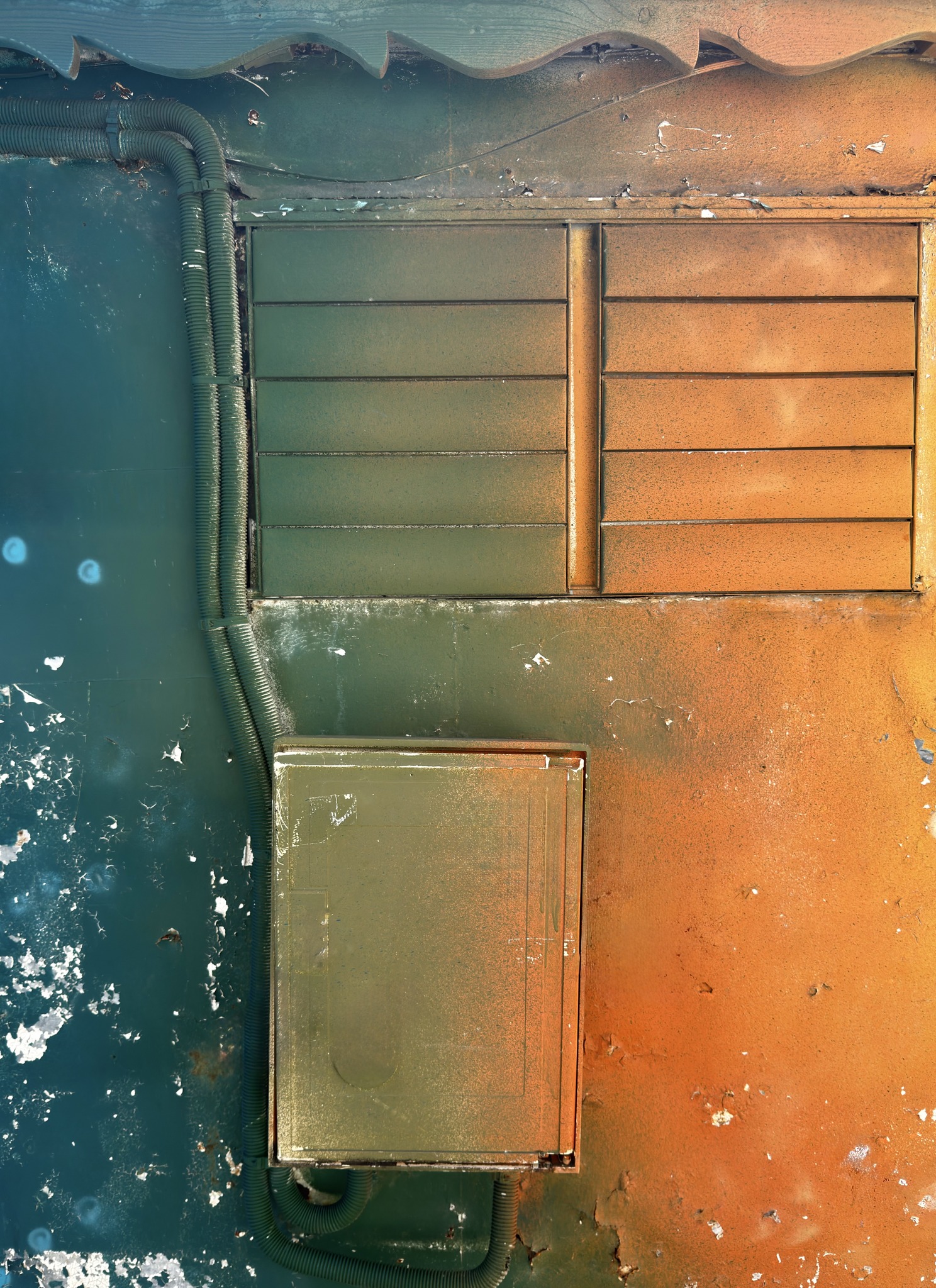
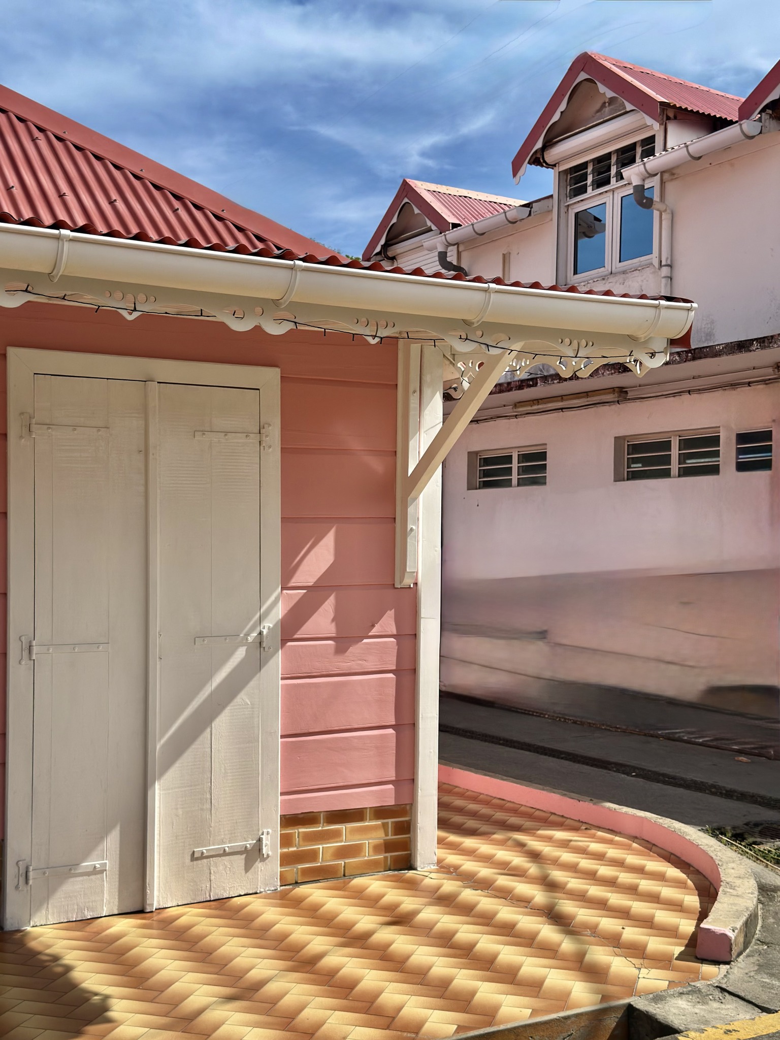
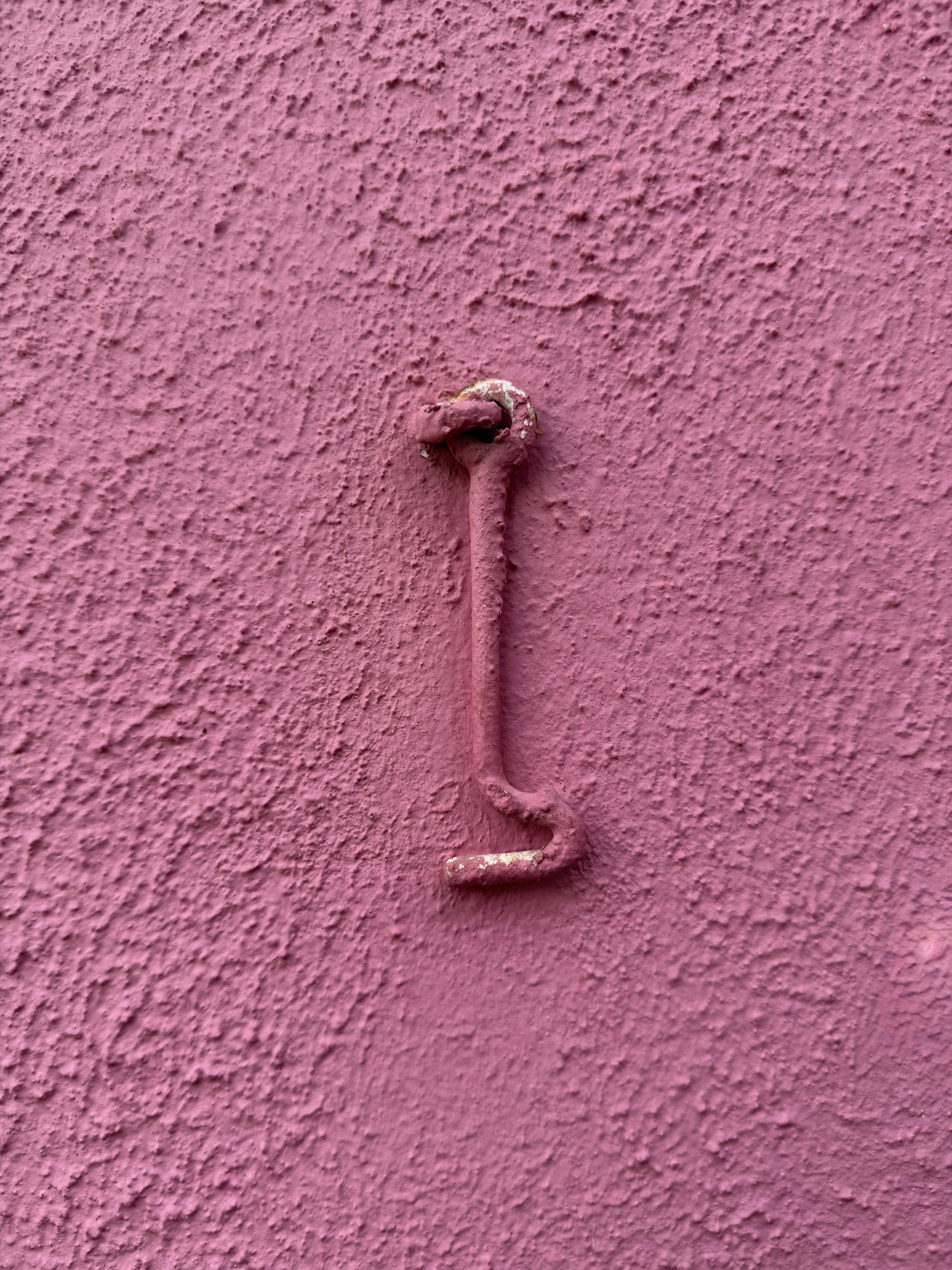
Sometimes the subject is barely a subject at all. A wall. A corner. A shadow. A slice of paint. A bit of architecture doing nothing particularly heroic. These are the images that people sometimes glance at and say, “Oh… nothing.”
Nothing is doing a lot of work in those moments.
What they’re really saying is: there’s no obvious story. No person performing. No postcard view. No obvious hook. And that’s exactly the point.
Because when light, color, and design come together, they don’t need permission from subject matter to matter.
They create their own gravity.
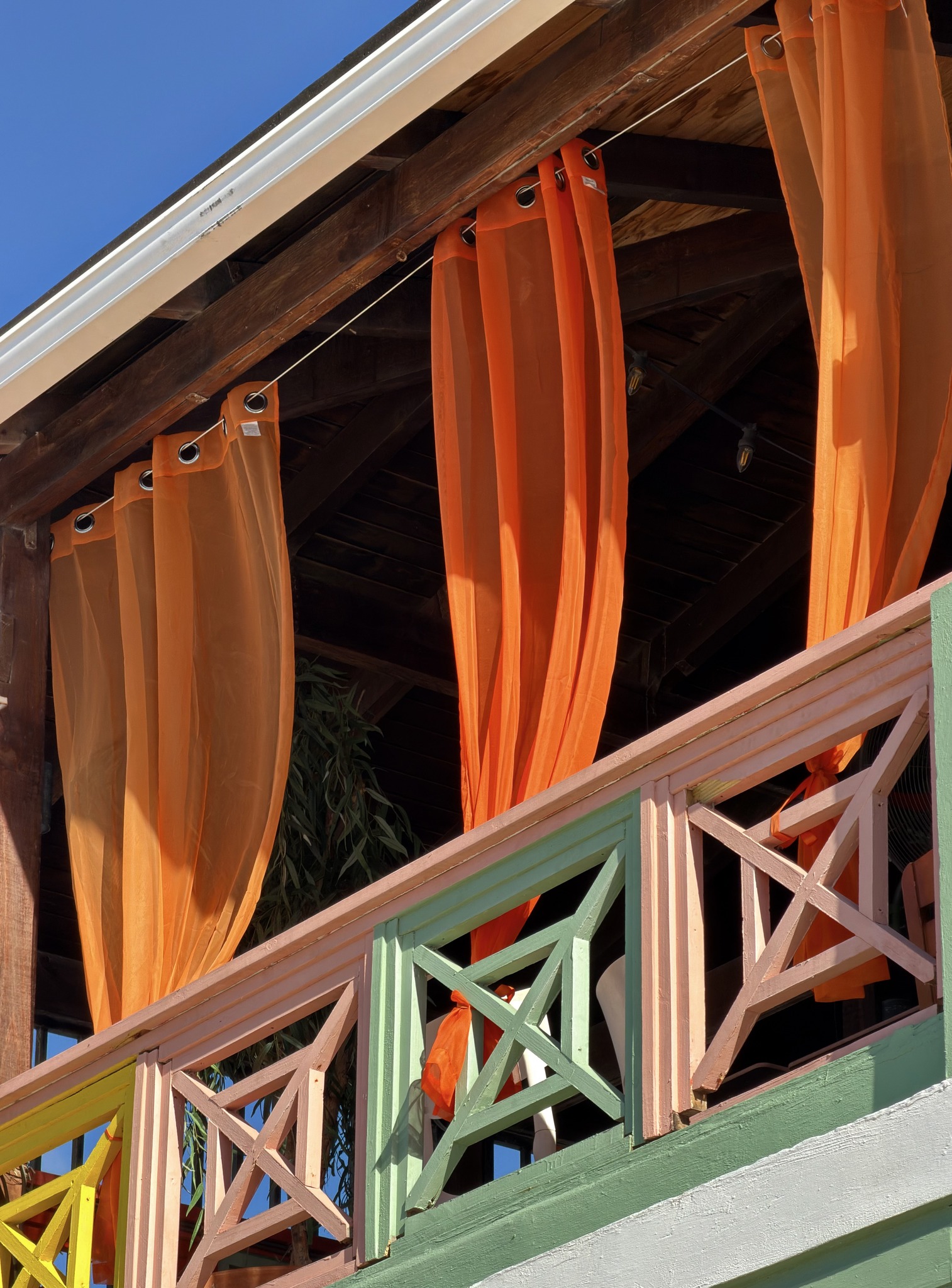
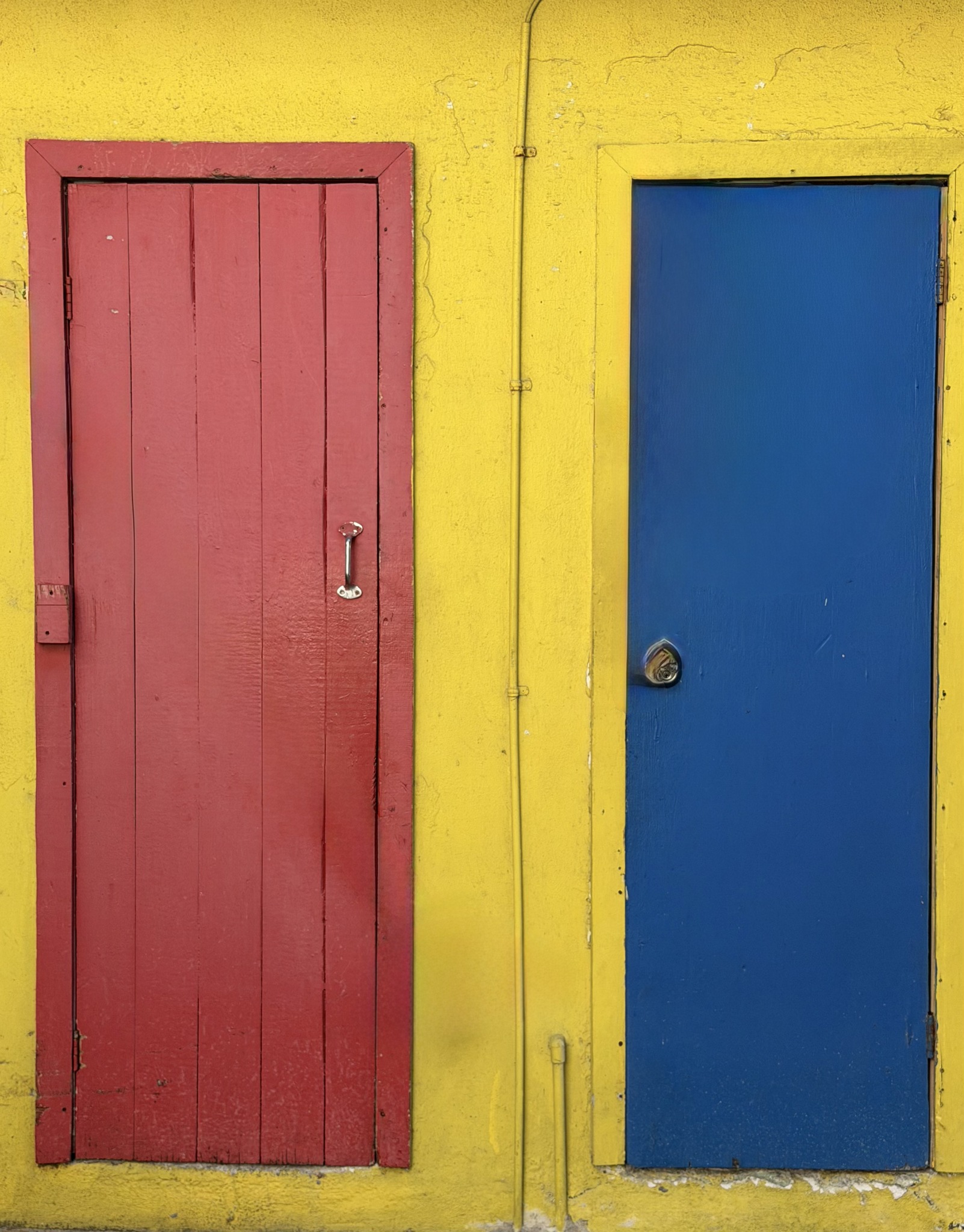
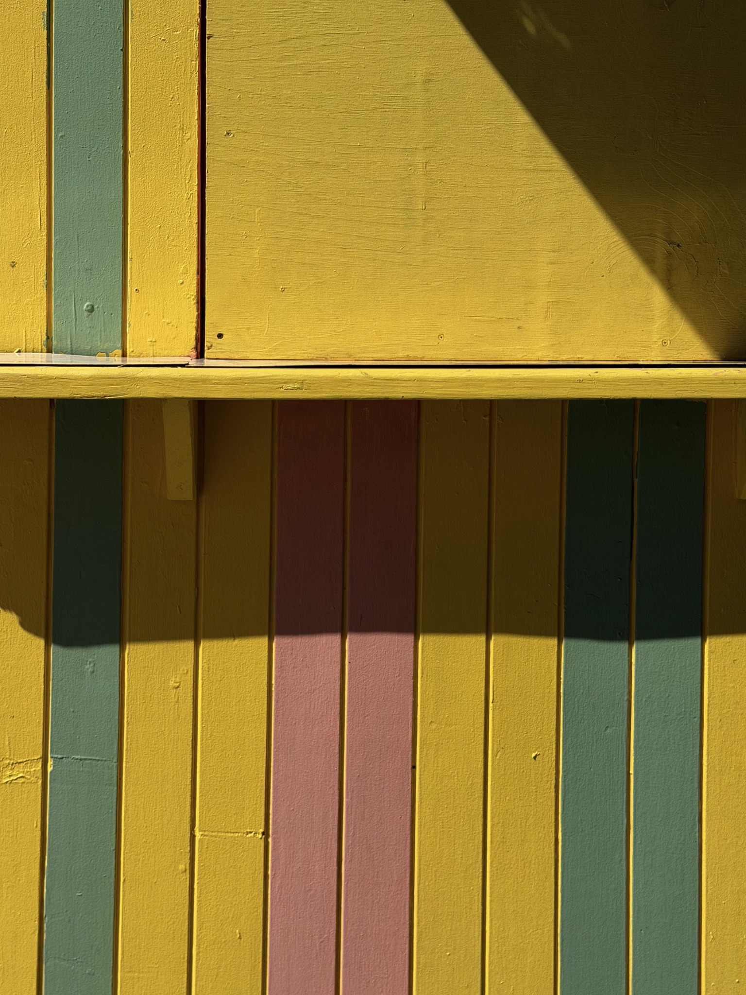
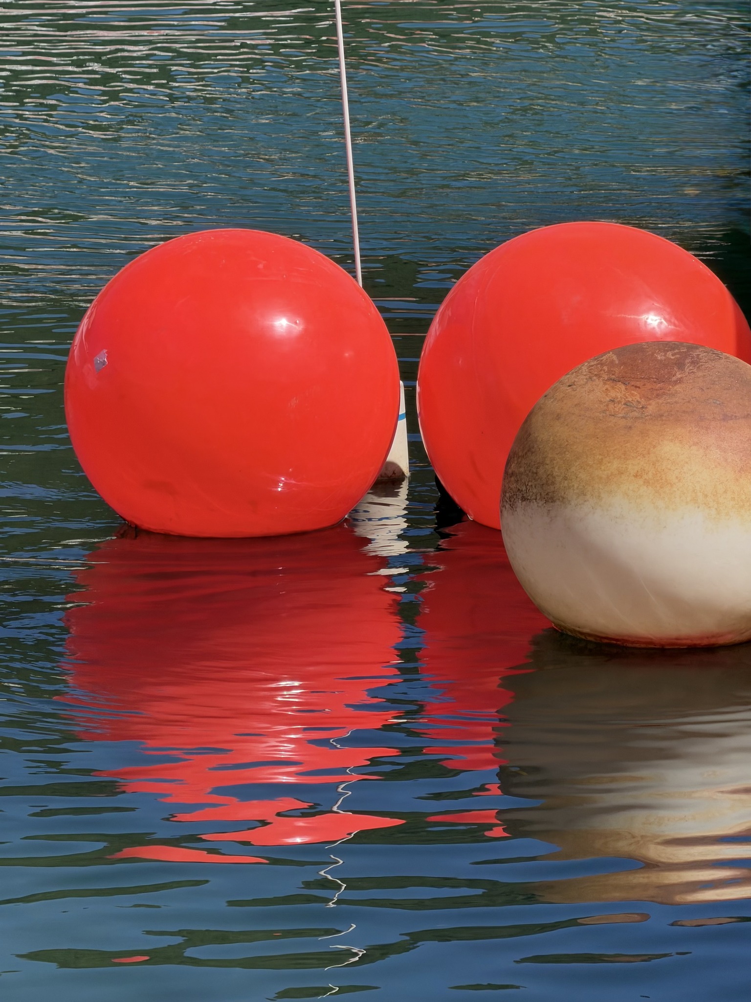
Design gives the frame bones. It decides where your eye enters, where it lingers, where it exits. It’s the reason a photograph feels calm or anxious, settled or off-kilter. Design is why you stay longer than you meant to.
Color sets the emotional register. Warmth. Coolness. Tension. Nostalgia. Color doesn’t just decorate a photograph—it defines how it feels to be inside it.
And light—light is the negotiator between reality and interpretation. It tells you what matters without saying a word. It hides as much as it reveals. It’s the difference between seeing something and feeling something.
When those three are aligned, I don’t care what camera I used. I don’t care what settings were involved. I don’t care whether the moment could be repeated.
It already happened.
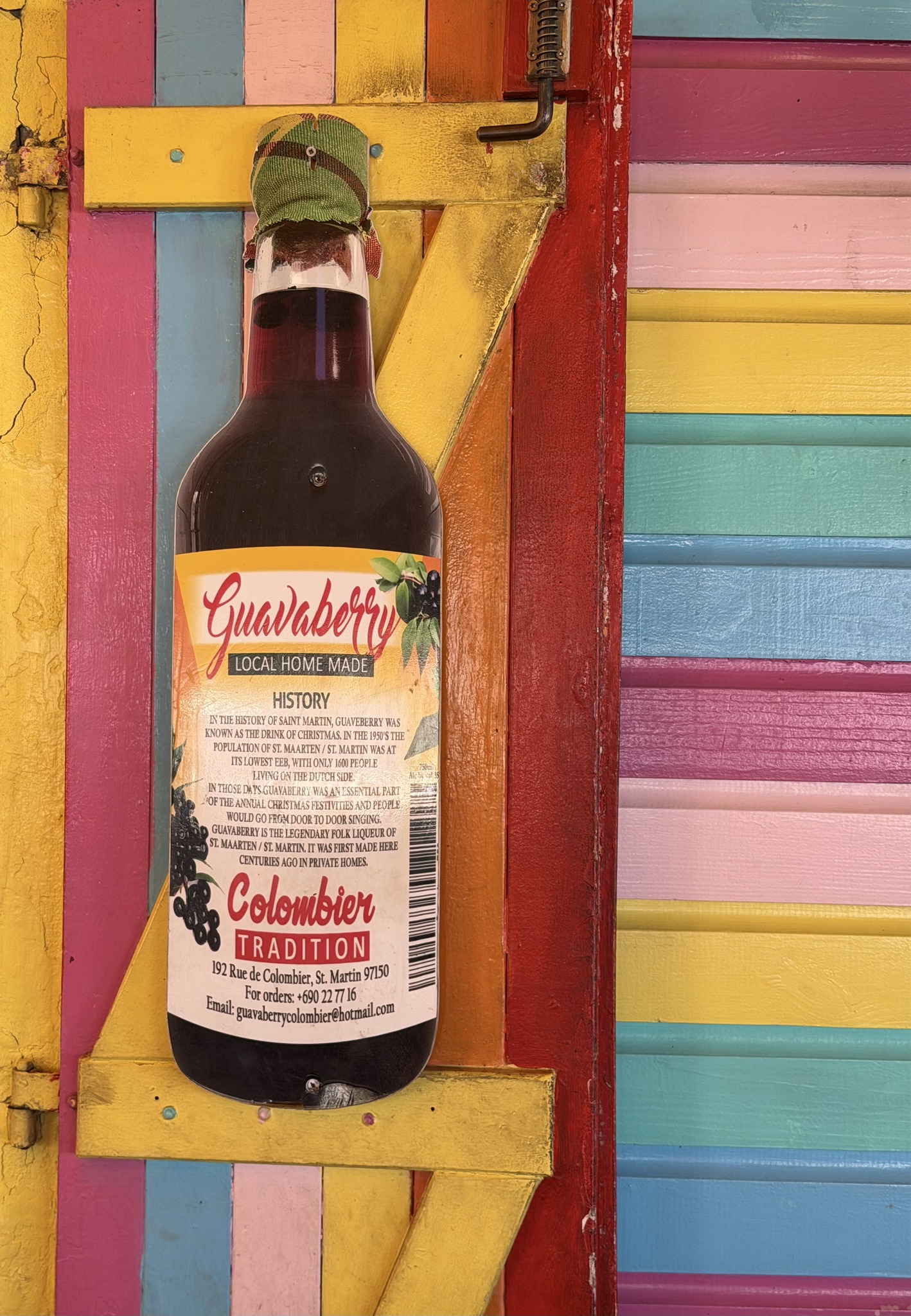
And yes, for context—and because honesty matters—I shot these photographs while working for Star Clippers, traveling aboard Star Flyer in the Caribbean, using my iPhone 17 Pro Max.
But that’s footnote information.
Useful.
Accurate.
Secondary.
The real story is not the ship, the assignment, or the device. The real story is how often we mistake photography for subject-hunting when it’s actually perception-training.
I didn’t go looking for “great photos.”
I went looking at light.
Noticing color.
Feeling design.
The photographs followed.
That’s the trinity at work. Not as a checklist, but as a way of being present in the world. A way of seeing that doesn’t turn off when the camera goes back in your pocket.
Light. Color. Design.
Not rules.
Not tricks.
Not buzzwords.
Just the quiet, stubborn architecture of how remarkable photographs—and remarkable seeing—actually happen.
Click.
Jack.