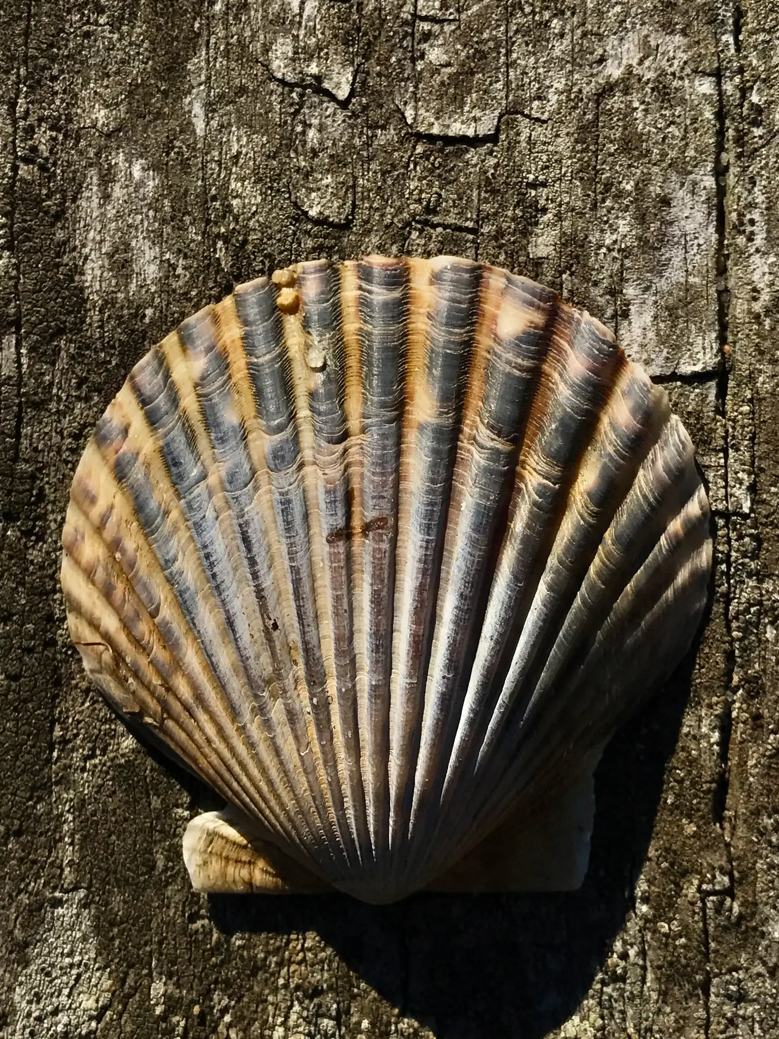
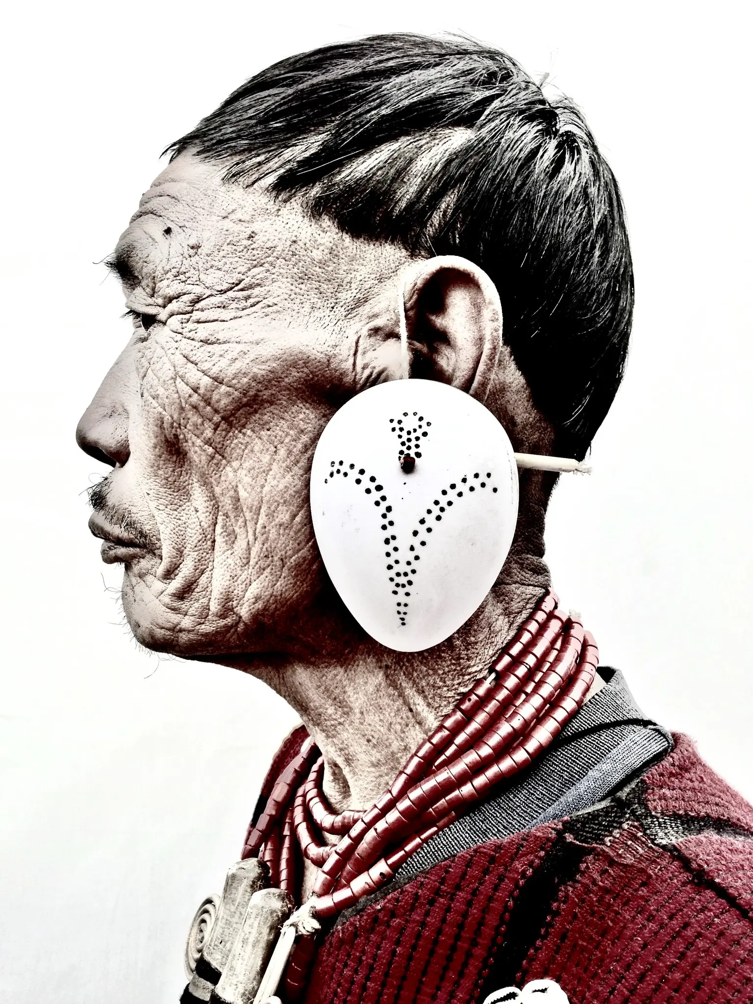
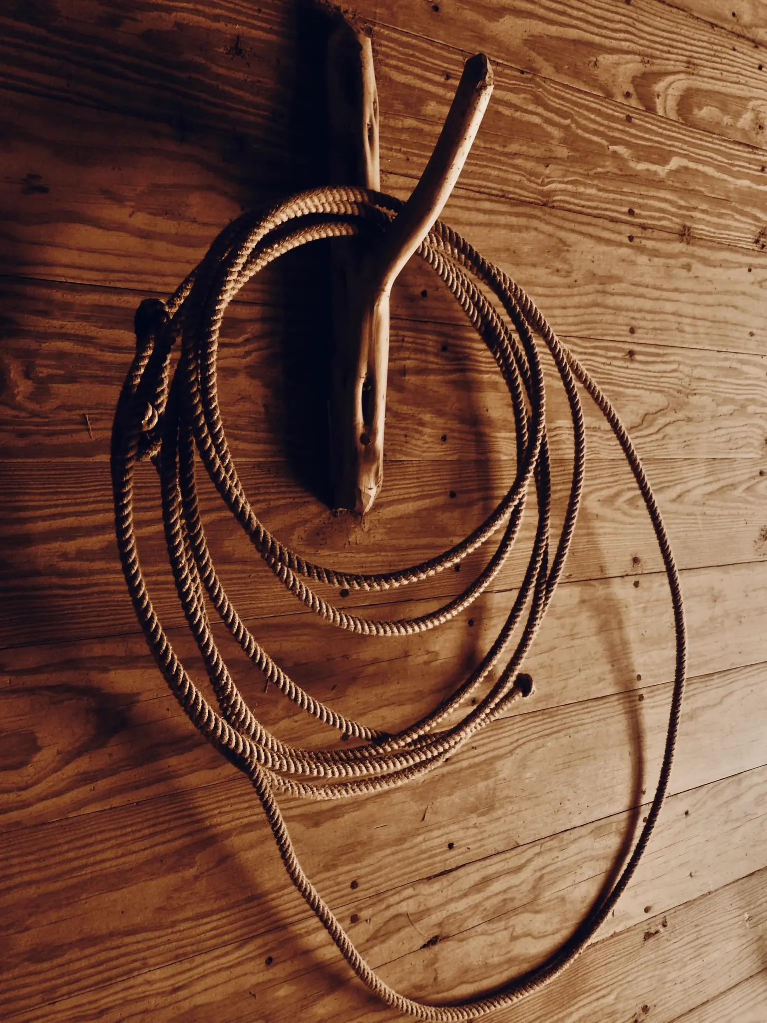
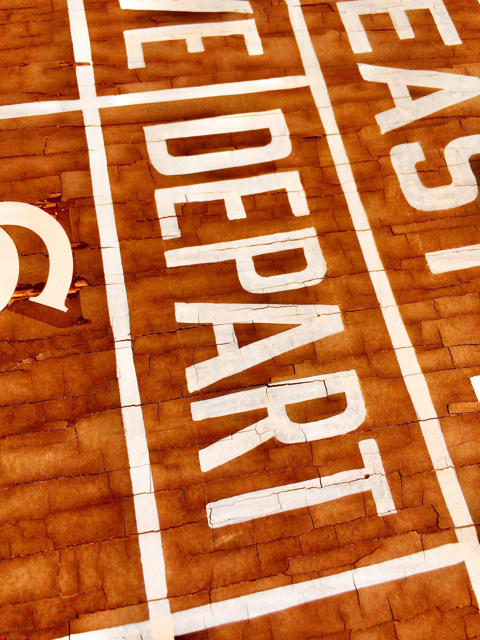
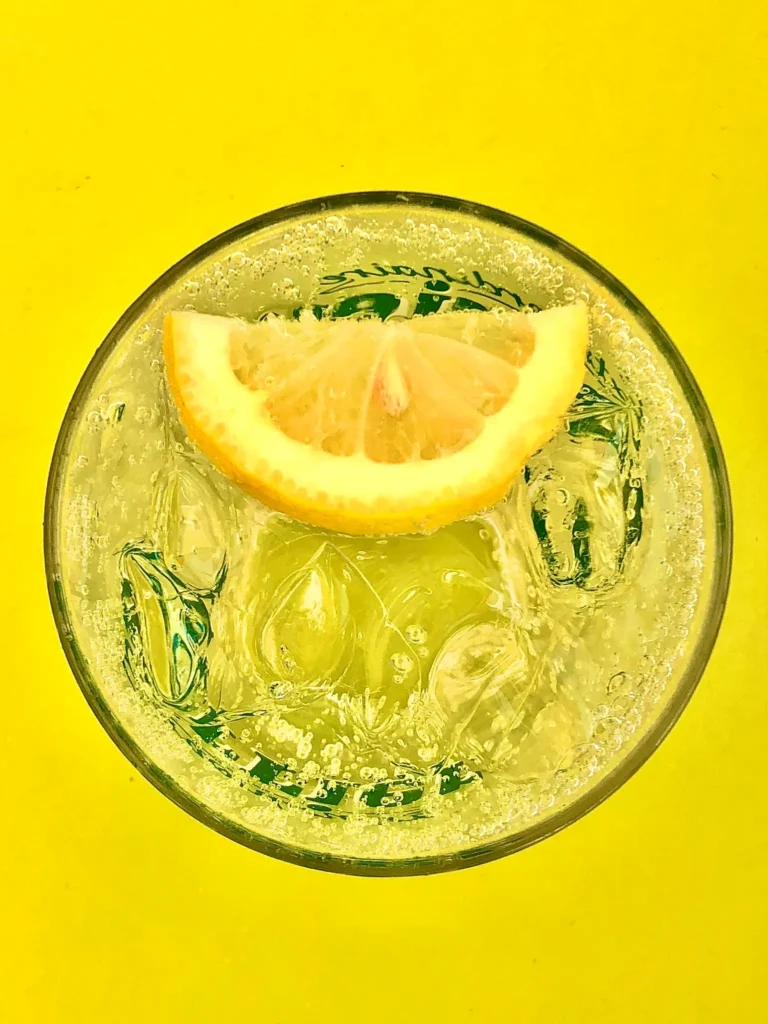
Monochromatic, technically speaking, contains or uses a single color.
Like a photo that is all or mostly black, or all and mostly white, or all or mostly red, or all and mostly blue, etc
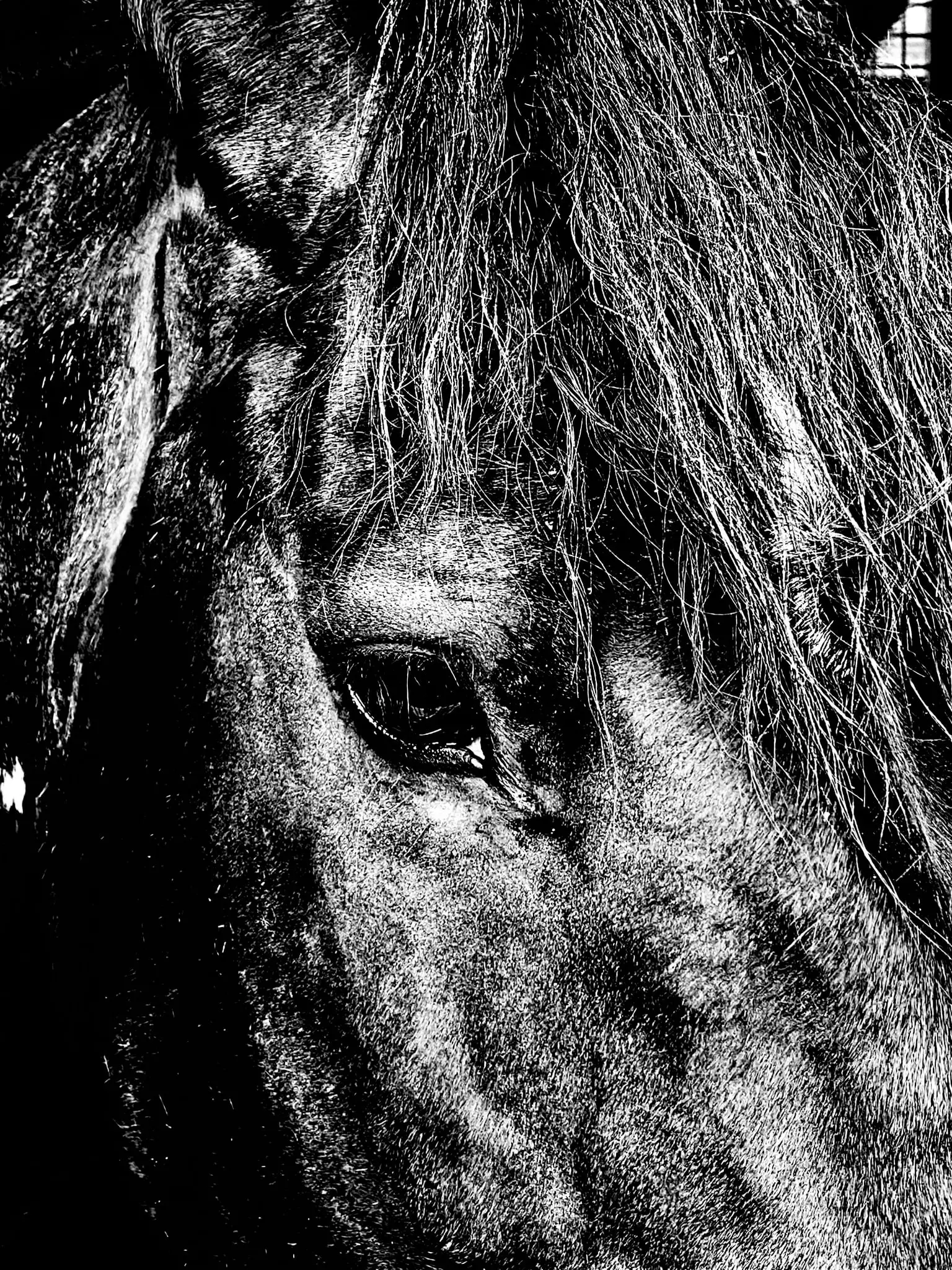
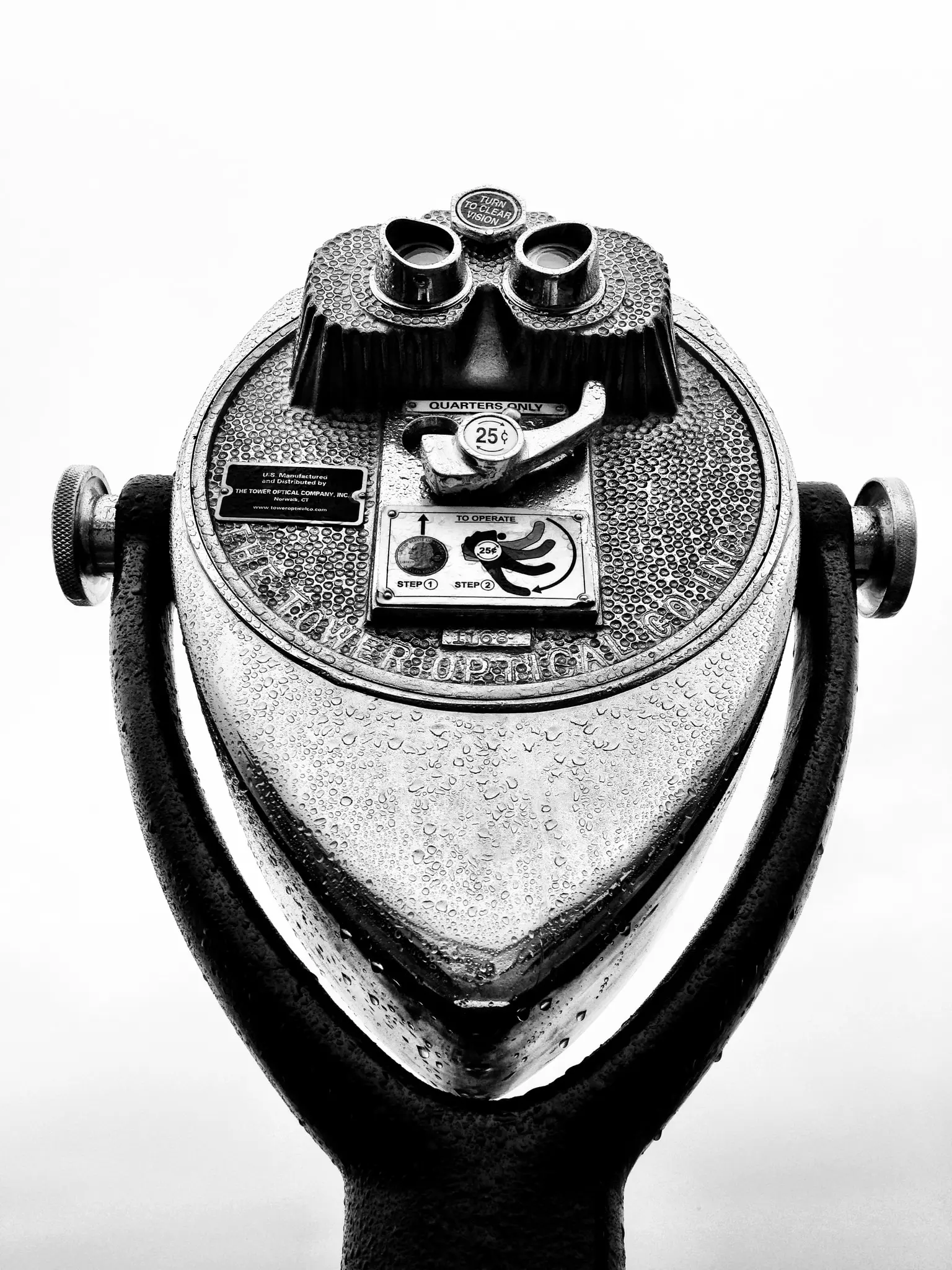
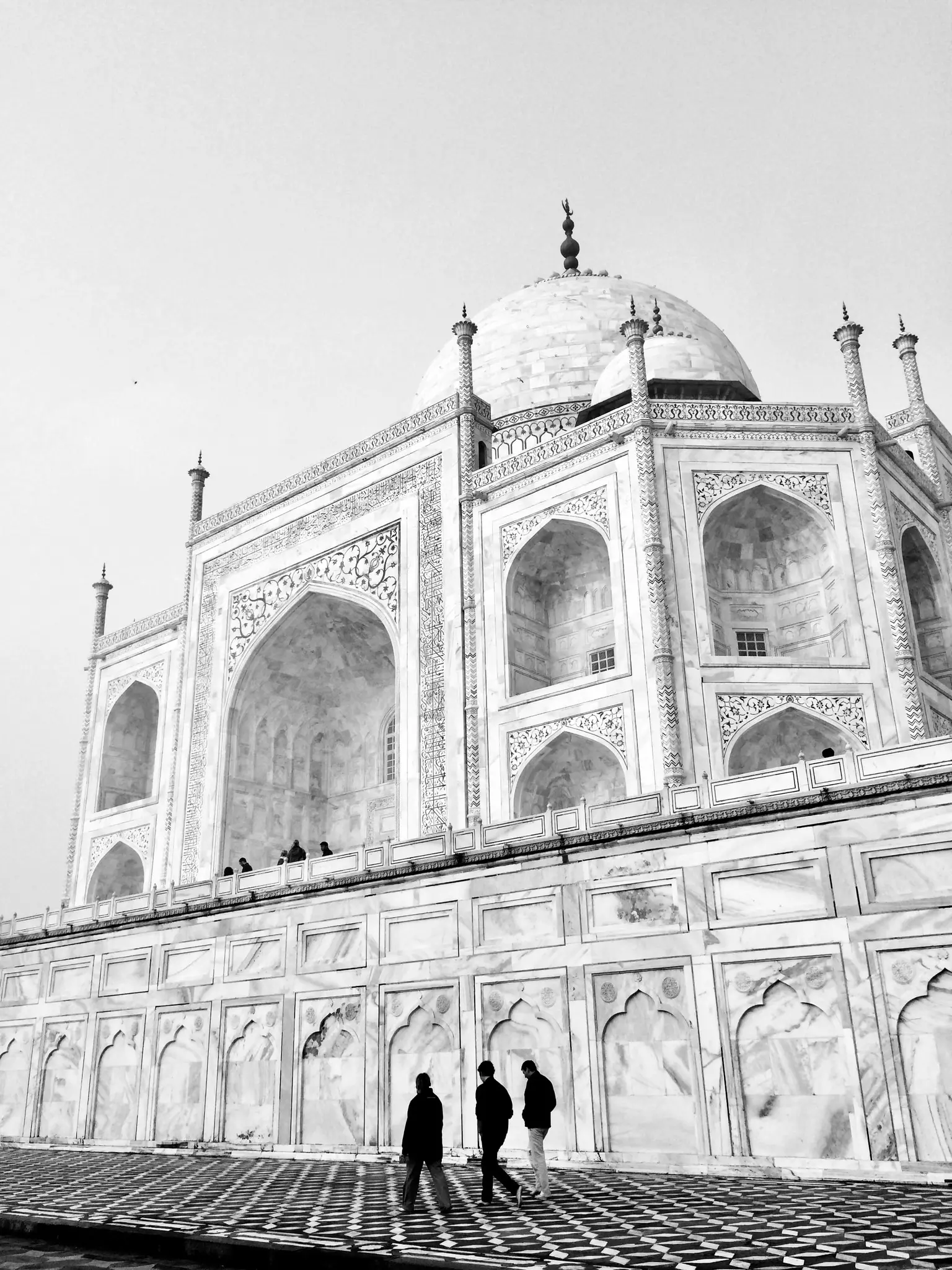
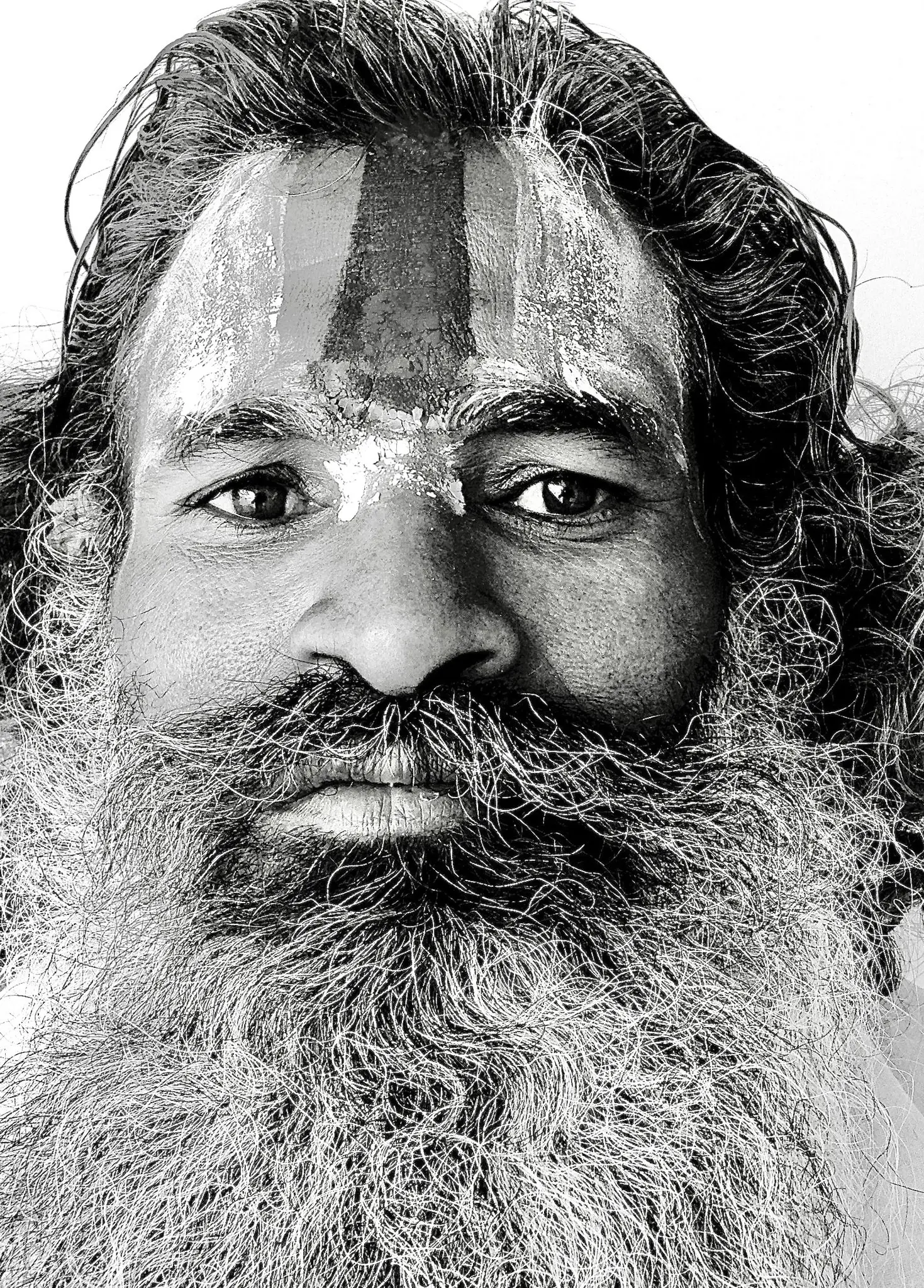
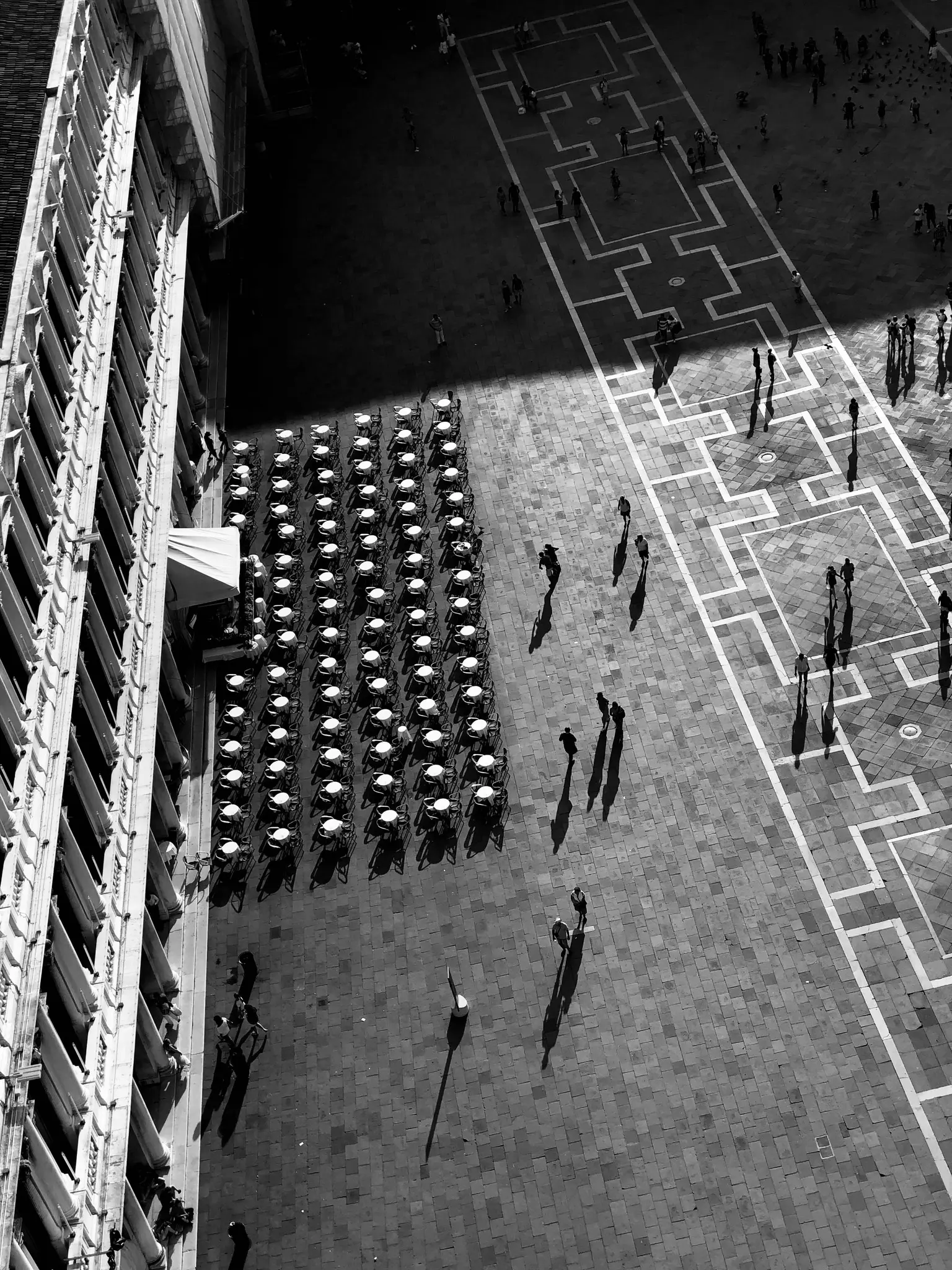
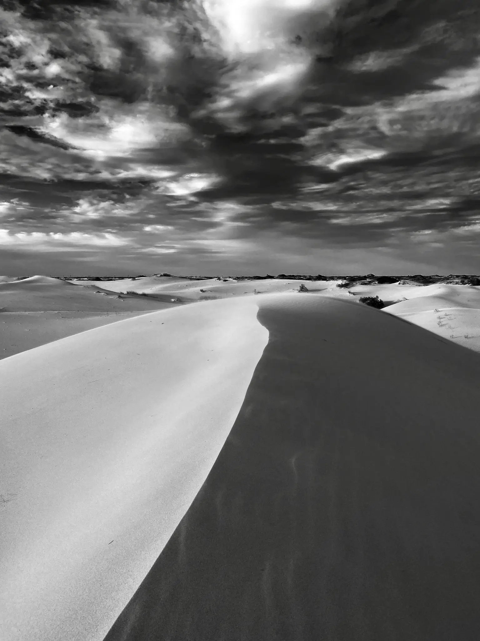
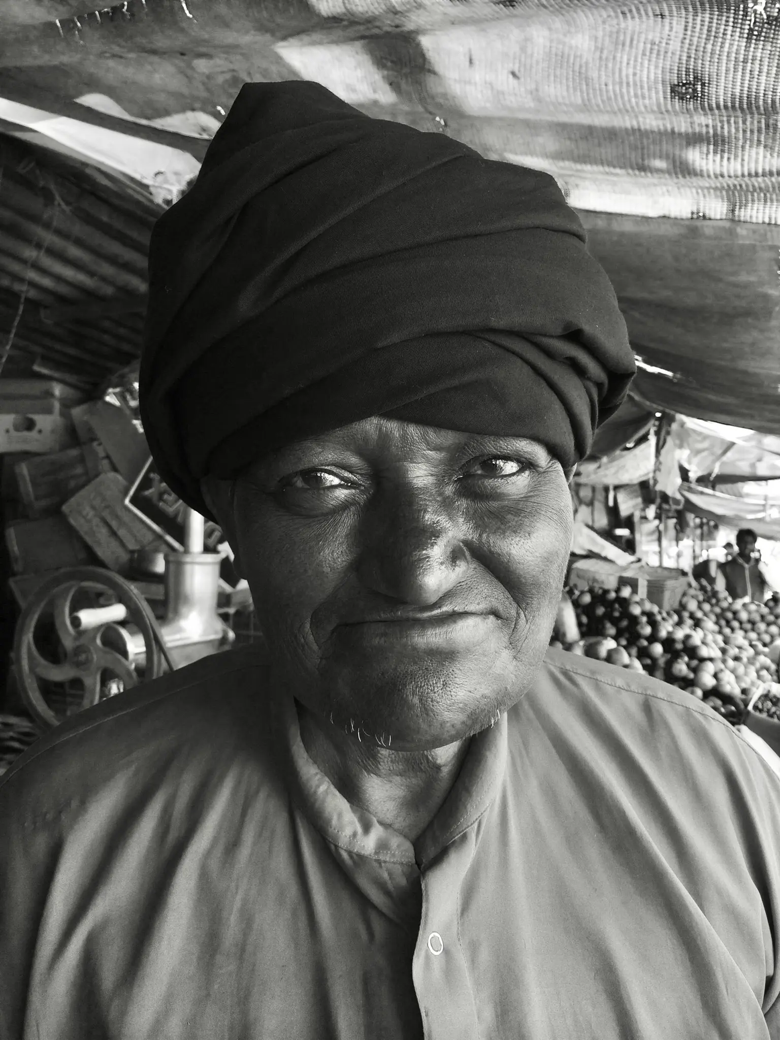
Generally speaking, in modern photography anyway, monochromatic is generally reserved for describing tones and shades of grey or, specifically, black and white photography.
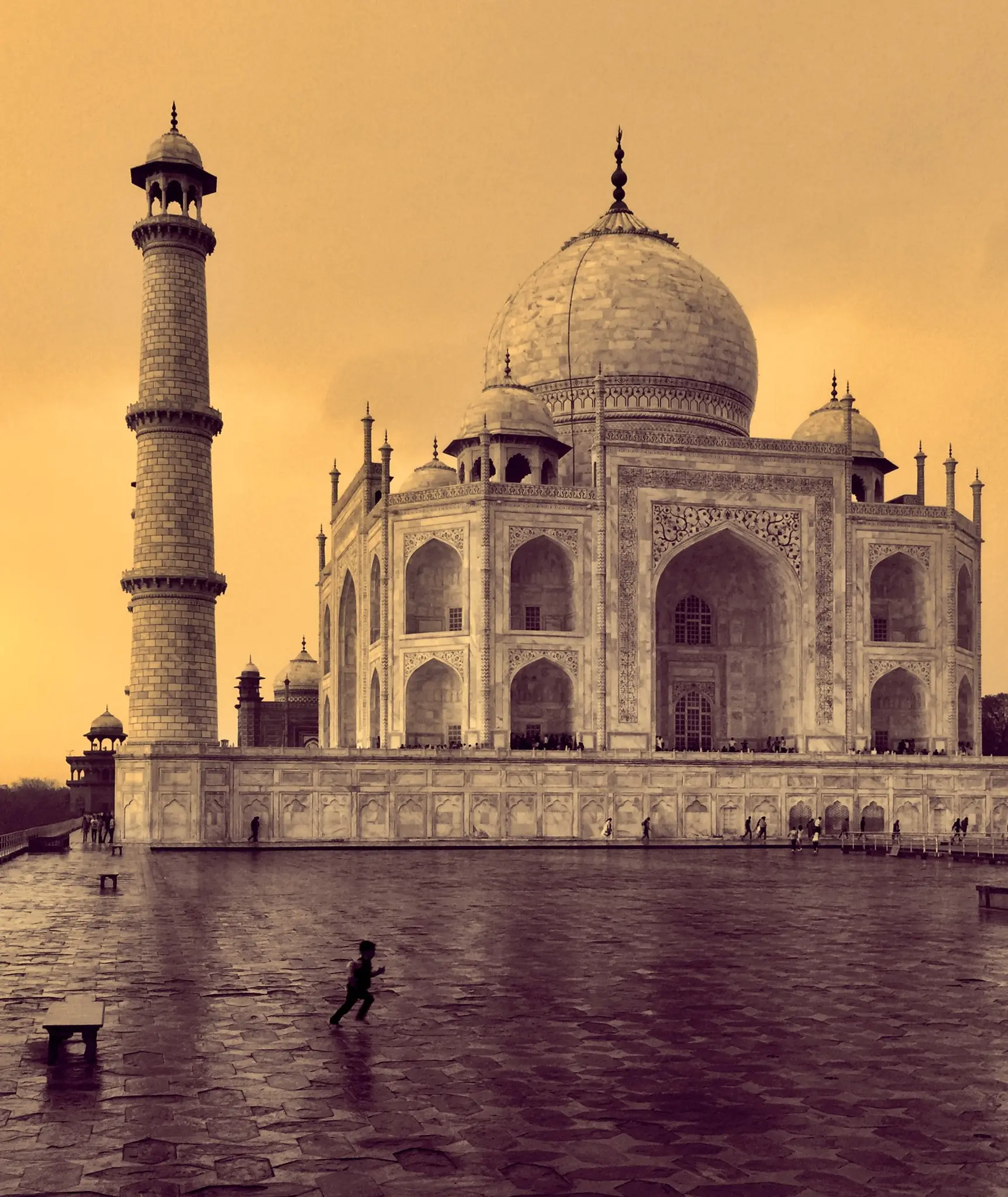
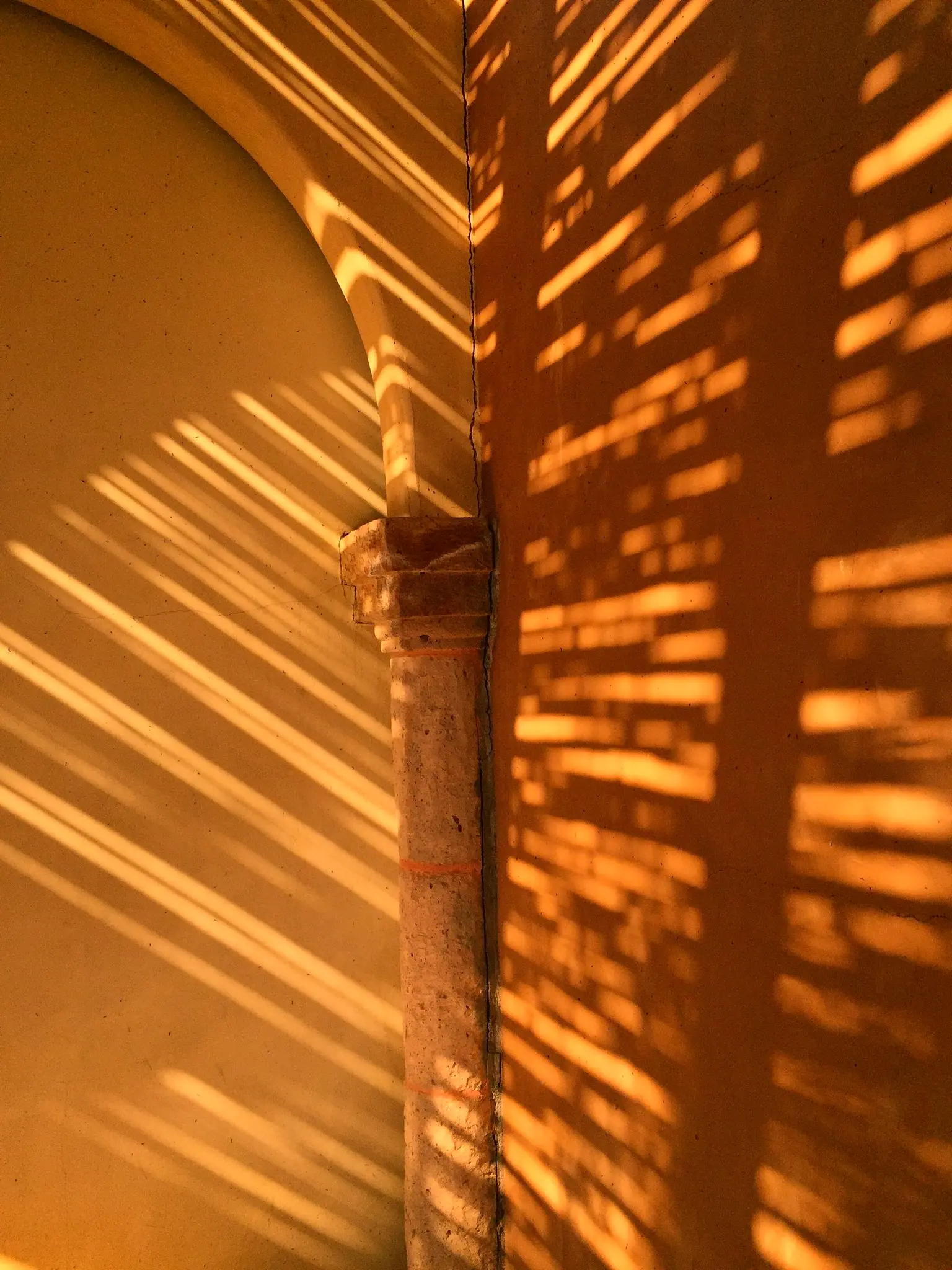
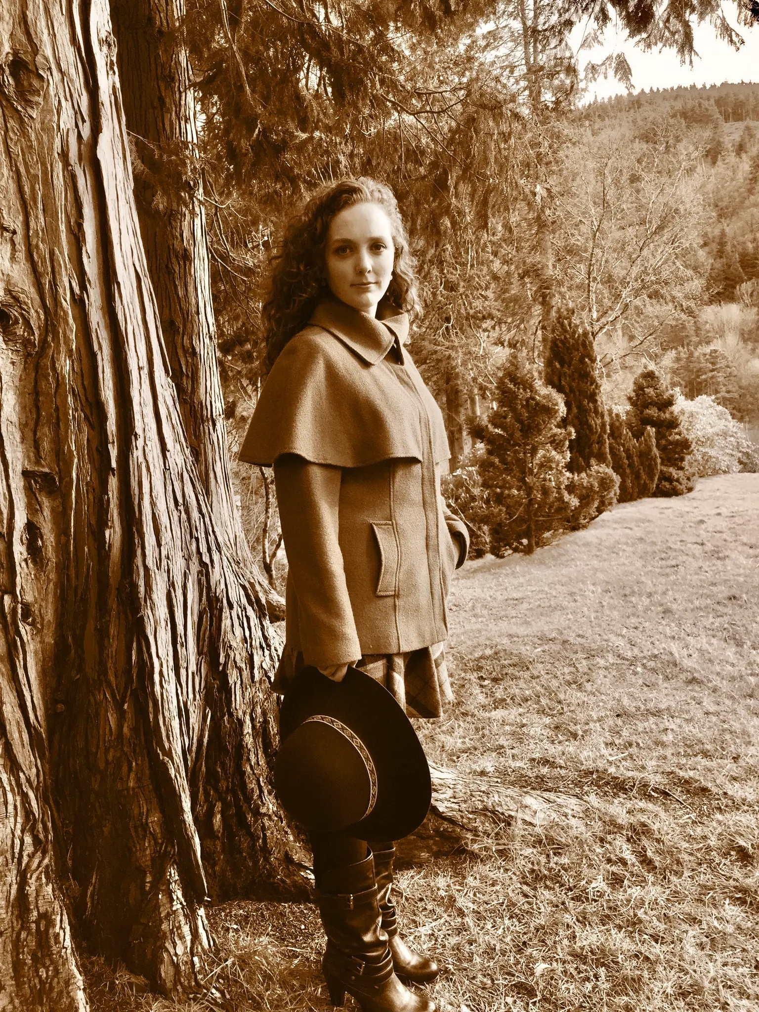
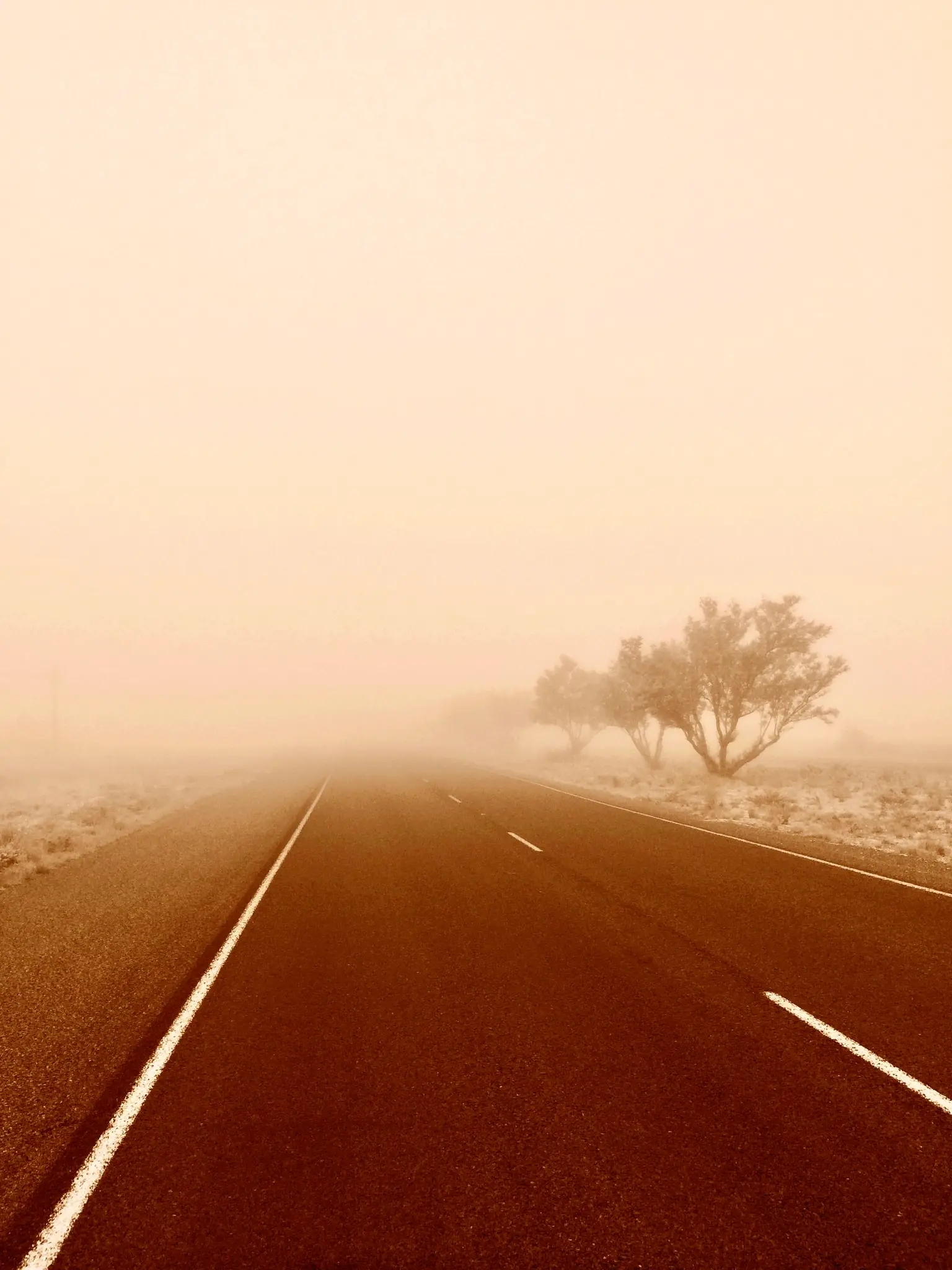
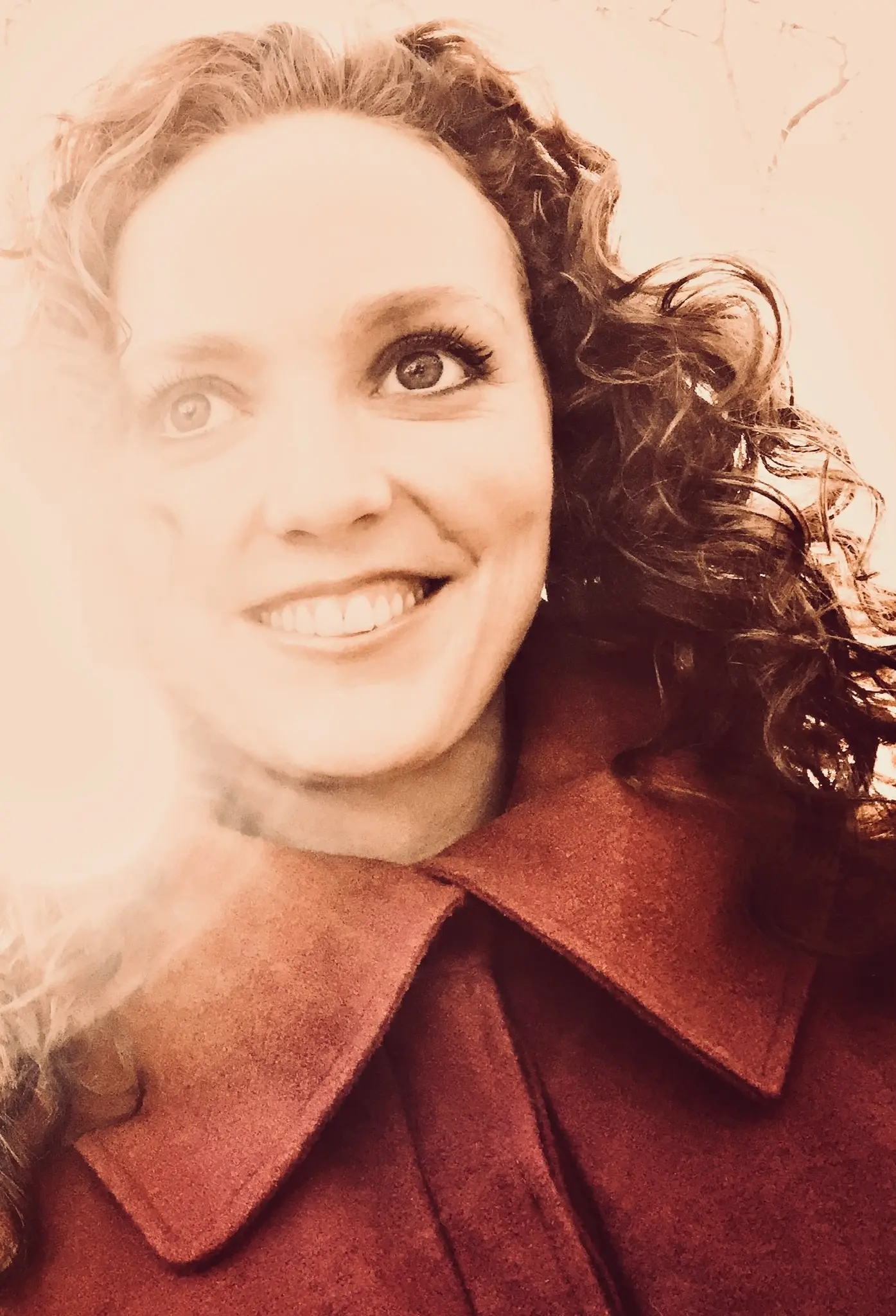
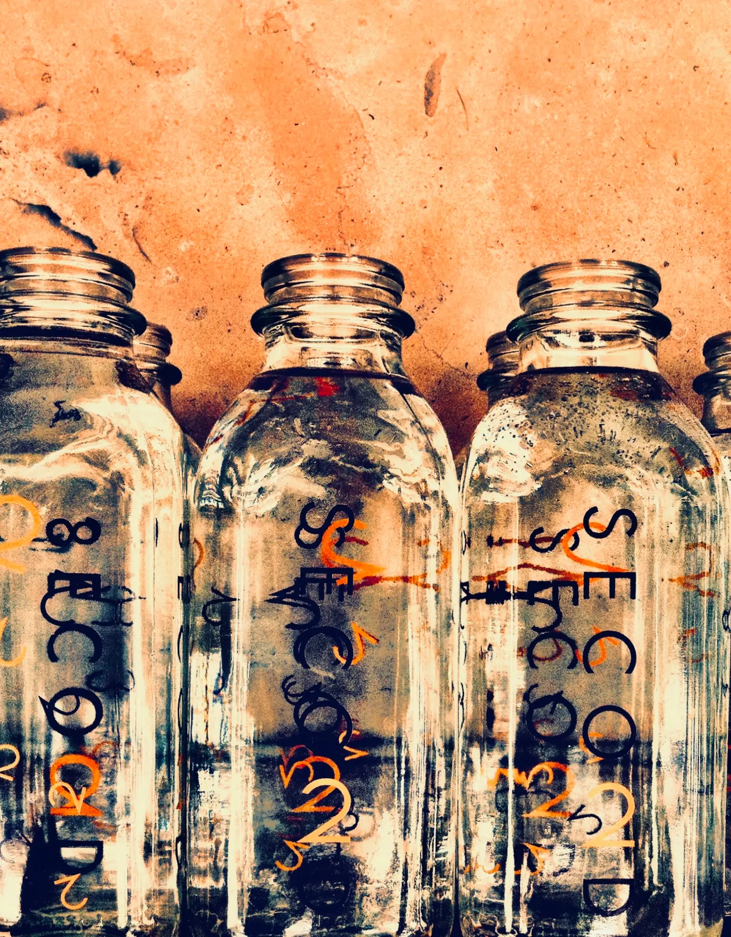
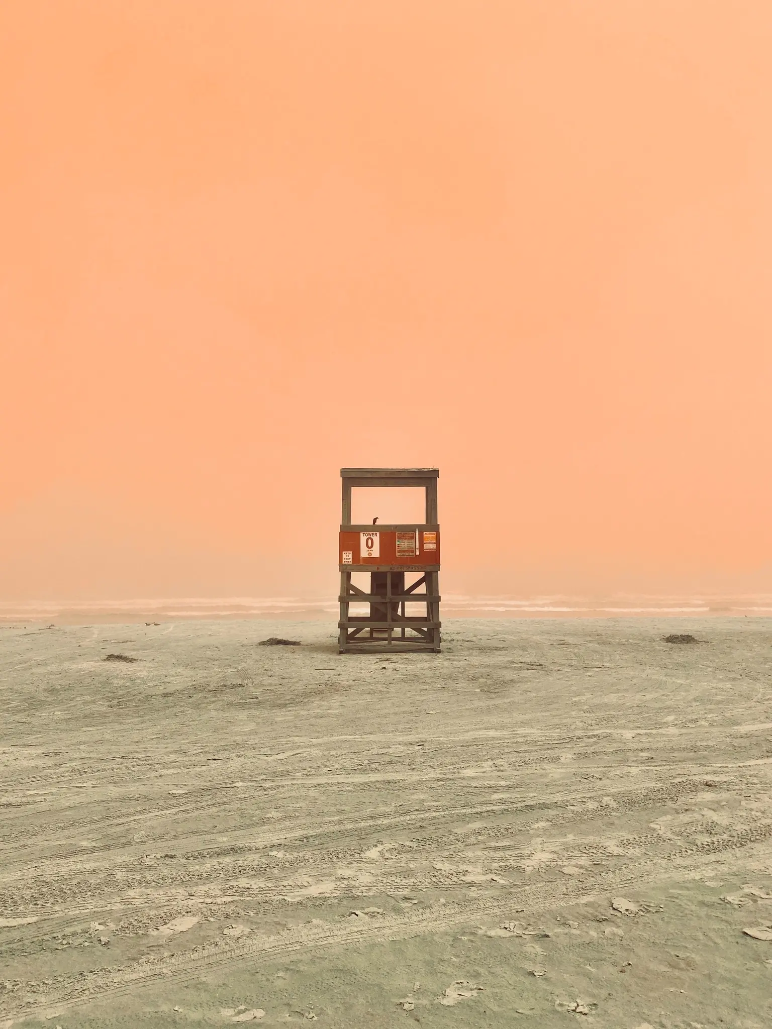
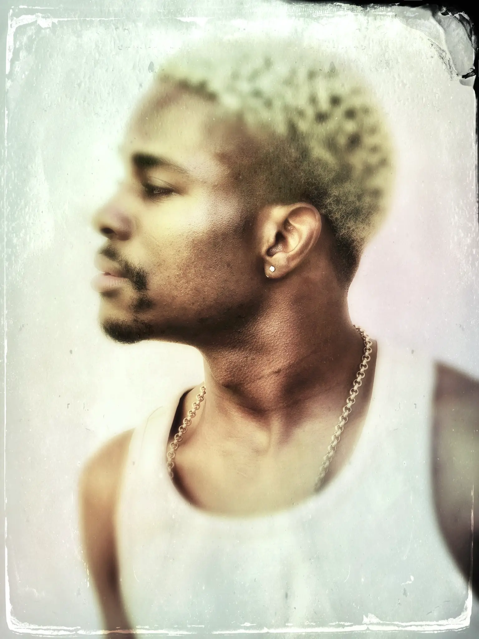
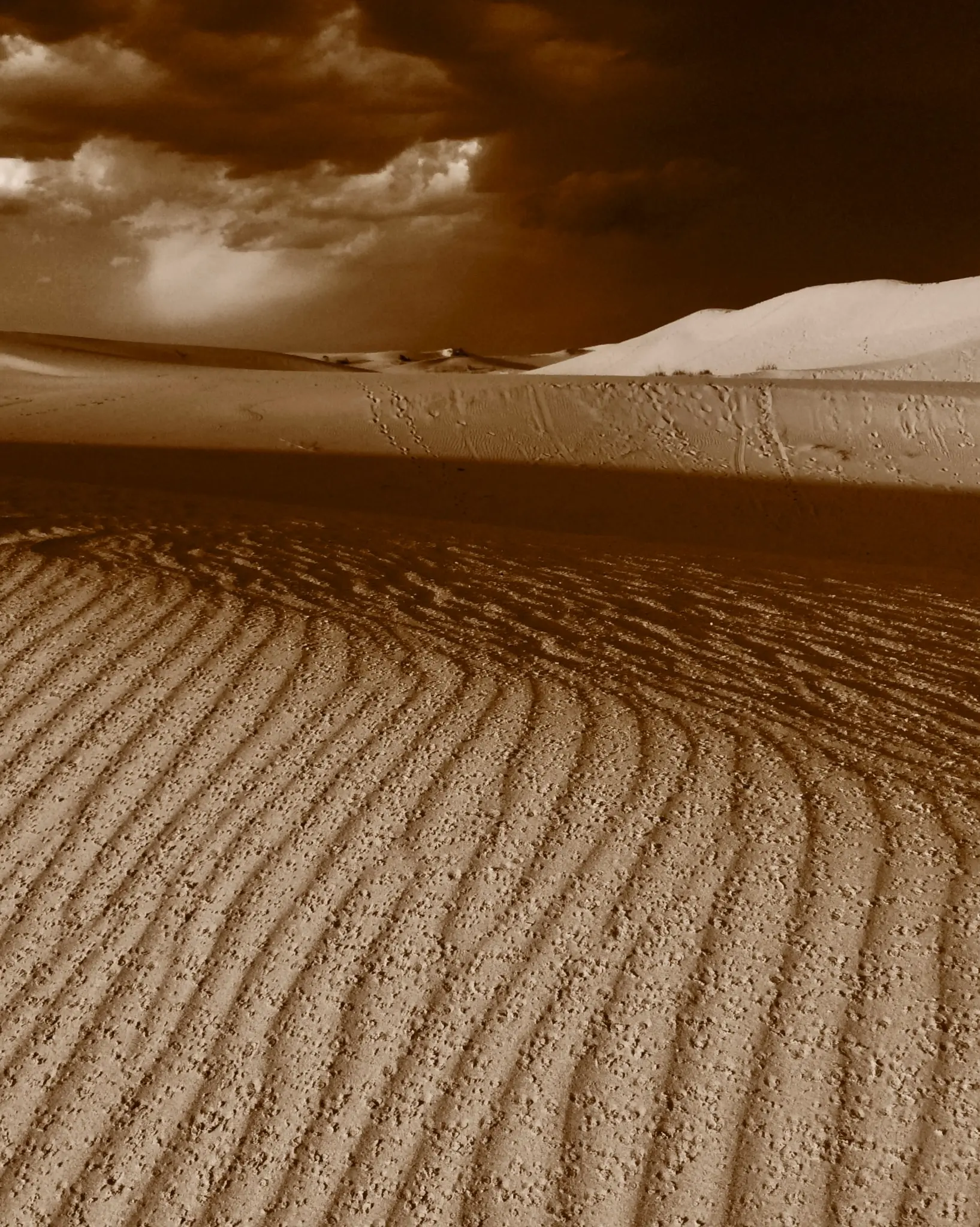
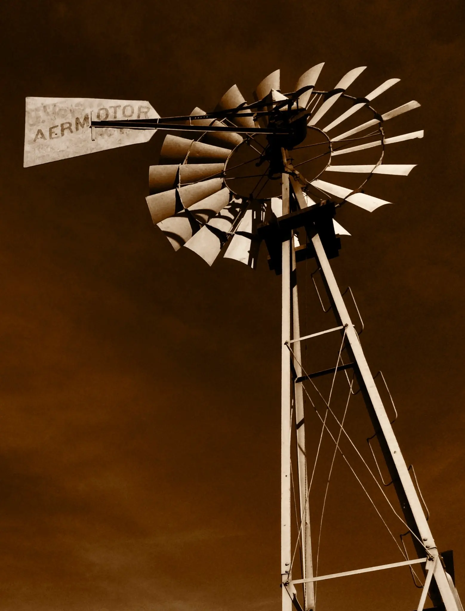
As a photographer, I tend to more loosely define the term, monochromatic, and think of it more like a palette of muted colors and tones.
You know, full well, by now, that I bleed color in my photography.
So when I see and record something, in my folio, that is more muted and monochromatic in nature, more often then not, it’s likely because I was feeling emotionally melancholy at the time of capture?
Which is probably the main reason you don’t see many of these muted tones in my body of work.
Because, again, the colors in life get the lion-share on my attention and attachment.
I don’t have too much melancholy in me I guess? So be it.
Developing a monochromatic palette in photography involves using a single color or tone throughout your images to create a cohesive look and feel.
The photographer’s technical skills can also play a role in using monochromatic color, as some photographers may be more adept at adjusting camera settings and post-processing techniques to create a cohesive and impactful monochromatic palette.
Overall, the use of monochromatic color in photography is a creative choice influenced by various factors, and there is no right or wrong way to approach it.
The way that photographers, myself included, perceive color and create a monochromatic palette can be influenced by a variety of factors, including their personal preferences, experiences, cultural background, frame of mind, and mental health.
Click.
Jack